

Solving lighting challenges when using a Deep Winter colour palette
por Mae Osz en Sep 06, 2025
Have you ever wondered why your deep winter colour palette sometimes feels flat or too dark once the lights go on?
It’s not your colours—it’s your lighting!
The right illumination can completely transform bold winter tones, making them feel vibrant, cosy, and dramatic all at once. With just a few smart lighting choices, you can keep your sapphire blues, emerald greens, and charcoals looking striking, while still creating a warm and inviting atmosphere. Let’s explore how to make your palette truly shine.
Key Takeaways:
- Using a deep winter colour palette in your space demands careful lighting choices to highlight rich hues without dullness.
- Combining natural light with warm artificial lighting can balance the cool, intense tones typical of a deep winter colour palette.
- Layered lighting—such as ambient, task, and accent lights—helps to create depth and dimension when working with a deep winter colour palette.
- Matte and satin finishes on walls or décor paired with the right lighting soften the intensity of the deep winter colour palette for a cosy feel.
- Experimenting with adjustable lighting options allows you to adapt your space’s mood and ensure the deep winter colour palette remains vibrant throughout the day.

Illuminating Your Deep Winter colour Palette: Choosing the Right Light Sources
Lighting can transform how your deep winter colour palette appears, bringing richness or dullness depending on the source. I’ve found that selecting the right light sources helps enhance those cool, intense blues, emerald greens, and striking charcoals without washing them out. For instance, light that mimics daylight tends to reveal the vibrancy of deep winter tones far better than warmer bulbs, which may dull their impact. Be mindful of the shade temperature your lighting provides; aim for bulbs around 4000K to 5000K to maintain that crisp clarity associated with this palette.
In spaces where natural light falls short, layering becomes your best ally. Mixing ambient, task, and accent lighting allows you to highlight artwork, furnishings, or textured walls painted in deep winter colours with more dimension. I like to use a combination of bright LED downlights paired with softer lampshades to add warmth and avoid harsh contrasts. This method prevents the space from feeling cold or sterile—something many worry about when working with such bold, cool hues.

The Power of Natural Light
Natural light has a special relationship with the deep winter colour palette. Because this palette thrives on cool, saturated shades, daylight helps reveal its full depth and richness. Light from north-facing windows, for example, tends to be cooler and softer, perfectly complementing the crisp lines and jewel tones that deep winter encourages. I recommend positioning key artworks or seating areas near these light sources to maximise that serene, invigorating atmosphere.
However, direct sunlight can sometimes cause reflective glare or make darker colours look flat. To avoid this, I often suggest using sheer curtains or blinds that diffuse incoming light gently. This way, you keep the room bright and pleasant without overwhelming those intense hues with too much brightness. You could even experiment with mirror placements to bounce natural light into darker corners, spreading a subtle glow across your carefully curated palette.

Layering Light for Depth and Warmth
Layering your lighting strategy is a wonderful way to add both depth and warmth to interiors featuring the deep winter colour palette. Overhead lighting alone tends to flatten the richness of deep shades, so combining different types of light sources creates a more inviting space. For instance, pairing recessed ceiling lights with wall lamps and floor lamps gives control over where the light lands and how it interacts with your colour choices. I love using dimmable options here, as you can soften the illumination by evening and let those blues and greens almost shimmer under low light.
Accent lighting can draw the eye to standout features such as wall art, textured fabric, or deep winter-inspired accessories. I once worked on a lounge where a navy feature wall was complemented by warm-toned LED strips hidden behind floating shelves. This setup emphasised the contrast between shadows and light without losing the cool palette’s signature crispness. You might find that this approach not only adds cosy warmth but also feels more dynamic throughout the day and night.
Adding layers doesn’t mean complicating your space. Think of it as building a lighting wardrobe—each source plays a role, whether it’s the main event or a subtle accent. By mixing intensities and locations, your deep winter colour palette will feel far more inviting and balanced, avoiding those cold or stark pitfalls often feared with darker tones. Plus, it encourages you to interact with your home on different levels, crafting moods for relaxation, work, or socialising.

Balancing Cool and Warm Tones
The beauty of a deep winter colour palette lies in its striking contrast between cool, crisp hues and occasional warm accents. Balancing these tones can really make your space feel harmonious, yet full of character. For instance, pairing deep navy or charcoal with subtle touches of rich burgundy or warm caramel can bring a sophisticated balance, preventing the room from feeling either too cold or overwhelmingly warm. I often suggest layering cool hues as the base and then introducing warm accessories or art pieces to gently soften the environment.
Mixing these tones isn’t just about colour matching; it’s about atmosphere too. Warm tones inject comfort, perfect for creating inviting lounges or cosy bedrooms. On the other hand, cool tones enhance calmness, ideal for meditation corners or minimalist spaces. Striking a balance can be as simple as choosing a deep winter wall art piece that features both icy blues and warm russets, drawing your eye and uniting the room’s palette.


Selecting Fixtures that Enhance Your Colour Scheme
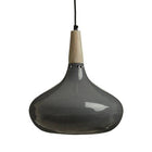
Lighting fixtures play an underestimated role in supporting a deep winter colour palette. Choosing fixtures with materials like brushed steel or matte black can complement the cooler side beautifully, while warm brass or copper finishes add an elegant contrast. For example, a copper pendant light over a navy feature wall will punctuate warmth within the cooler context.
Additionally, the style of your fixtures should reflect the mood you wish to create. Sleek, modern designs amplify the sharpness of cooler shades, whereas rounded or vintage-style fixtures can soften the overall look and enhance the welcoming element of warm tones. Personally, I find mixing finishes within one room works wonders—just keep it balanced to avoid cluttered visuals.

Avoiding Colour Clashes with Light Temperature
Light temperature is a make-or-break factor when working with a deep winter colour palette. Cool white or daylight bulbs often enhance the blue and grey undertones, preserving the crisp, fresh feel of the palette. Conversely, warmer light can sometimes make these colours appear dull or muted, which clashes with the palette’s strength.
On the flip side, overly cool lighting in a room with warm accent colours risks creating an uninviting, cold atmosphere. I’ve seen rooms where soft amber bulbs beautifully complement deep red or burnt orange accessories, but the same bulbs lessen the vibrancy of cool sapphire or emerald hues. Finding the right balance means being mindful of where you use each light temperature.
Avoiding Colour Clashes with Light Temperature: Key Points
|
Light Temperature |
Effect on Deep Winter Colours |
|
Cool White (4000K–5000K) |
Enhances blues, greys, and jewel tones; maintains crispness |
|
Warm White (2700K–3000K) |
Softens warm accents but can dull cool tones if overused |
|
Daylight (5000K+) |
Best for task lighting; keeps colours vivid but can feel harsh if unfiltered |
|
Dimmer Controls |
Allow flexible mood-setting, making lighting adaptable for different times |
Sometimes, it’s a subtle tweak to your bulbs that makes a huge difference. Adding dimmers helps in shifting the light’s intensity, allowing the deep winter colours in your space to reveal their full depth throughout the day and night. Layered lighting—with a mix of ambient, task, and accent fixtures—helps avoid one-dimensional colour rendering, making the palette truly shine.
Creative Solutions for Dim Spaces
Rooms painted or decorated in a deep winter colour palette often feel luxurious and intimate but can sometimes struggle with low light levels. When you’re working with rich, dark hues like deep blues, cool greys, and intense blacks, natural light can quickly feel swallowed up. Instead of letting your space feel gloomy, consider ways to add brightness and an inviting glow without sacrificing that classy winter vibe.
Adding layers of light—ambient, task, and accent—brings depth and warmth to dim corners. For example, a velvet navy wall paired with soft white lampshades on brass fixtures can create a chic contrast, enhancing both the room’s atmosphere and the artwork you showcase. Think about how light bounces across different surfaces and how you can highlight your favourite pieces using clever illumination.
Illuminating with Mirrors and Reflective Surfaces
Using mirrors in a dark-hued room is one of my favourite tricks to maximise light. A well-placed mirror opposite a window or even near a light source can double the natural light entering the space. Plus, mirrors create a sense of depth, making smaller rooms feel more expansive and less confined — a perfect remedy when working with a deep winter colour palette.
Reflective surfaces don’t stop at mirrors. Glossy finishes on furniture, metallic accents in your décor, or even glass-fronted cabinets amplify whatever light is in the room. I recently helped a client with a moody charcoal lounge install velvet cushions in jewel tones alongside gold-framed mirrors. The result was a room that felt rich yet illuminated, proving that reflections can soften even the deepest colours without dulling their impact.

Choosing the Right Bulb: Lumens vs Watts
Sorting out your electric lighting means looking beyond just watts. While watts historically indicated brightness, today lumens measure the light output much more accurately. For a room decorated in the deep winter colour palette, aiming for bulbs with at least 800 lumens helps ensure the colours remain vibrant and the room stays inviting.
Warm white bulbs (around 2700K) can sometimes muddy cooler winter shades, so I often suggest bulbs that sit between 3500K and 4100K for clearer, crisper light that complements deep winter tones. LED bulbs offer these options affordably and with less energy use. Additionally, dimmable fittings give you control to match the lighting to different moods — vital for rooms where you want to feel relaxed yet visually comfortable.
More light doesn’t always mean more watts. Lumens measure how bright the bulb is, while watts refer to energy consumed. For example, an LED bulb using just 9 watts can produce the same 800 lumens as a ten times higher wattage old incandescent bulb. When choosing bulbs to brighten a deep winter colour scheme, focus on lumens to get the right intensity without unnecessary energy usage.

Customising Light Placement for Impact
Adjusting light placement can completely transform how a deep winter colour palette appears in your space. Walls painted or adorned with rich navy, deep emerald, or charcoal tones tend to absorb a lot of light. Thus, positioning your lights strategically ensures these hues don’t feel heavy or overwhelming. I often find that placing adjustable ceiling spotlights angled towards feature walls brightens up these intense colours without washing them out.
Layering light sources at different heights enhances depth and texture around the room. For instance, using recessed lights above eye level combined with softer ambient lighting from wall sconces can create a beautifully balanced room. This method invites the eye to move naturally across your wall art and décor, emphasising the unique qualities of the deep winter colour palette, especially during the shorter, dimmer days in the UK.
Spotlighting Art: Techniques for Showcasing Wall Art
Wall art deserves the spotlight – literally. For a room painted in a deep winter colour palette, spotlighting can prevent artworks from blending into the darker backdrop. I recommend adjustable spotlights with a narrow beam angle, around 25 degrees. These cast focused light, elevating paintings or prints without creating glare or harsh shadows. Position them slightly above and angled downward at about 30 degrees for the best effect.
Another subtle yet effective trick is to use LED picture lights mounted directly over your art pieces. They offer even, warm illumination that reveals intricate details and colours without distorting them. In fact, placing a warm white LED light (around 3000K) contrasts softly with cooler background colours of the deep winter colour palette. This keeps your wall art captivating, especially when natural light fades in the evenings.

Strategic Floor and Table Lamp Arrangements
Floor and table lamps provide both practical brightness and atmospheric charm, complementing the deep winter colour palette beautifully. I like to position a tall floor lamp with an upward-facing shade in darker corners to bounce light off the ceiling and soften shadows. This diffused glow gently balances the rich tones on your walls, preventing the room from feeling closed in.
Grouping table lamps in varying heights across surfaces can add visual interest. For example, placing a shorter lamp beside a vase or stack of books next to a taller lamp near an armchair creates a layered lighting effect. Choosing lampshades in light, neutral fabrics helps reflect light better, which contrasts well against the deep, moody undertones.
Combining dimmable lamps with standard overhead lighting allows you to adjust brightness depending on the mood or time of day. I often find myself lowering lamp levels during an evening unwind, creating a warm cocoon-like atmosphere that resonates perfectly with the immersive nature of a deep winter colour palette.

Transforming Sensory Experiences with Ambience
Lighting does more than just illuminate a room—it shapes how we feel within it. When working with a deep winter colour palette, the right ambience brings those rich, cool tones to life, enhancing the mood and personality of your space. I find that layering lighting sources—from soft accent lights to bold overhead fixtures—creates dimension and depth, inviting a sense of calm and drama all at once. In a room filled with navy blues, charcoal greys, and crisp whites, gentle, warm glows balance the cool colours beautifully, transforming interiors into serene retreats that soothe both eyes and mind.
I always consider how different light temperatures and intensities affect the sensory experience. For instance, a room bathed in daylight-mimicking bulbs feels more invigorating, ideal for work or social areas. On the other hand, dimmed, low-temperature LEDs paired with textured fabrics or velvet wall art soften the environment, perfect for unwinding after a busy day. The way light interacts with matte or glossy surfaces in a deep winter colour palette can also dramatically change the atmosphere, so experimenting with different fixtures and placement allows you to tailor the mood to your lifestyle.
Using Dimmers and Smart Lighting
Dimmers offer some of the easiest ways to finesse your lighting when using a deep winter colour palette. They give you full control over brightness, helping adjust the light to the time of day or mood you want to create. I’ve often found that lowering light levels in the evening not only makes cool hues feel more intimate but also reduces harsh shadows that can make dark colours feel heavy. Plus, dimmers are versatile enough to suit any room – from cosy bedrooms to elegant living spaces with deep blue or slate walls.
Smart lighting systems add another layer of convenience and creativity. Linking them with your smartphone or voice assistants means you can shift between pre-set moods or customise colour temperatures instantly. Imagine starting your morning with bright white light that energises, then fading to a soft amber in the evening that makes your deep winter colour palette come alive with warmth and depth. In my own home, using smart bulbs has helped me maintain a peaceful rhythm, especially in rooms where I want to combine style and comfort seamlessly.


The Role of Light in Mindfulness and Relaxation
Light impacts how calm or alert we feel, so it’s a powerful tool if you want your home to be a sanctuary. A deep winter colour palette naturally encourages a reflective mood, and pairing it with carefully tuned lighting enhances mindfulness and relaxation. By opting for soft, indirect light sources—like shaded lamps or wall washers—you can create serene pockets within your space that invite moments of quiet and meditation. The cool intensity of deep winter hues paired with gentle illumination encourages grounding and a slowed pace, which is just what we need to unwind.
I’ve noticed that lighting design can even influence how we connect with wall art or decor that reflects personal style. A well-lit corner with calming blue or icy white tones can become a visual anchor in your home, a place to pause and breathe amid busy days. Using layers of light rather than a single source gently guides your eyes across textures and details, creating a sensory experience that promotes mindfulness.
Exploring the connection between lighting and mindfulness reveals that warmth and intensity matter significantly. Cooler, dim light encourages your body to relax by lowering cortisol levels, while brighter, blue-rich light increases alertness. Balancing these effects with a deep winter colour palette means crafting spaces that serve both activity and rest. Ultimately, the goal is to control light so it supports your wellbeing while complementing the distinctive drama of your chosen tones.

Summing up
As a reminder, solving lighting challenges when using a deep winter colour palette can transform your space from feeling gloomy to wonderfully inviting. I’ve found that combining the right lighting with your carefully chosen bold and cool tones makes all the difference. Whether it’s layering soft ambient lights or adding strategic spotlights, thoughtful lighting helps your deep winter colour palette truly shine. Don’t be afraid to experiment with different bulbs and fixtures to find what enhances your home’s calm, elegant vibe. Your wall art and decor will look even more striking when the lighting complements those rich hues perfectly.
If you’re curious to hear how others tackle similar issues, check out this discussion on Any other pale dark winters struggle with any light colors?. It’s always encouraging to see shared experiences and tips from people who love the deep winter colour palette as much as you do. Together, with a bit of patience and creativity, you can create a beautifully balanced home atmosphere that feels both serene and visually captivating.
Pro Tips
Want more clever ideas for styling your home? Visit our Content Hub for expert tips and inspiration.
Here are 3 blogs that will pair beautifully with this one:
More About
Want to explore how colour and light interact even further? Check out Architectural Digest’s guide to decorating with colour and lighting for more expert advice and creative inspiration.


