

Wall Gallery Layouts Ideas That Will Transform Any Room
par Mae Osz sur Mar 12, 2026
Have you ever stood in front of a blank wall and felt overwhelmed, wondering how to turn that empty space into something captivating? You're not alone. Walls are more than just boundaries; they're canvases waiting to reflect your personality and style. A well-thought-out wall gallery can transform a room instantly, bringing warmth, colour, and inspiration to your home.
So, what's the secret to wall gallery layouts that truly refresh your space?
Whether you're passionate about mindful interiors or simply want to enhance your living environment, understanding wall gallery layouts can unlock your home's potential. When chosen and arranged thoughtfully, wall art adds a calming, aesthetic expression that complements any décor style.
This guide will walk you through creative ways to plan spacing, select frames, and balance your displays to suit your taste and room perfectly.
Ready to transform your walls and breathe new life into your rooms?
List of Contents
- Essential Types of Wall Gallery Layouts
- Planning Your Wall Gallery Layout
- Choosing the Right Frames and Matting
- Wall Gallery Layout Spacing Tips
- Balancing Your Gallery Wall for a Cohesive Look
- What are wall gallery layouts?
- How do you plan a gallery wall layout?
- What spacing works best for gallery walls?
- How do you make gallery walls look balanced?
Essential Types of Wall Gallery Layouts

Starting with a clear idea of the different types of wall gallery layouts can make all the difference. Knowing the style that fits your room and taste helps you narrow down choices and create a space that feels personalised. Here are the most popular wall gallery layouts that can transform any room:
Symmetrical Grid
This style arranges frames in a precise, even grid. It's perfect for a modern, clean look and works especially well with identical frame sizes and shapes. The symmetry creates a calming and organised vibe, often popular in living room décor where balance is essential.
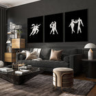
Salon-Style Eclectic
This is the artsy, layered look inspired by classic art museums. Frames vary in size, orientation, and often have different frame styles. The key here is to keep a consistent colour scheme or subject matter to prevent it from looking chaotic.
Linear or Row Layout
A straightforward choice where artworks align horizontally or vertically. It's ideal for narrow spaces like hallways or for creating a subtle yet polished effect in your room. The linear layout can also pair well with interior design concepts favouring minimalism or Scandinavian styles.
Central Focal Point with Surroundings
Here, one larger piece anchors the display, while smaller pieces surround it to complement. This approach draws attention and helps layer your wall with personality and depth. This works very well in bedrooms or above sofas where you want a focal art piece.
Asymmetric Balanced
Not everything needs to be perfectly aligned! Asymmetric balanced layouts mix frame sizes with thoughtful spacing and placement. This style feels organic and trendy, adding character without overwhelming the room. Use consistent frame colours and matting to keep it feeling cohesive.
Choosing any of these wall gallery layouts depends on your space, the art you want to display, and your personal flair. Feel free to mix and adapt these ideas as you customise your walls.

Planning Your Wall Gallery Layout

Planning is everything when it comes to wall gallery layouts. You might have beautiful art, but without a thoughtful layout, your wall can look cluttered or unbalanced. Here's how I like to approach it:
Start with the Wall and Room Dimensions
Measure the wall where you want to display your gallery. Knowing the space will guide the size and number of frames. You want the gallery to "fit" the wall visually, neither overpowering nor lost on it.
Consider Your Existing Room Layout
Think about furniture placement and how the wall art can complement your room. For example, a gallery above a sofa often looks best centred and at eye level. If you're working in a hallway or narrow space, a linear gallery might suit better. See our room layout ideas for inspiration.
Mock It Up Before Hanging
Lay your chosen pieces on the floor, experiment with arrangements, and take photos. Alternatively, use paper cut-outs taped to the wall to view the overall look before committing. This step helps avoid unnecessary holes and ensures a harmonious layout.
- Start with your largest piece as an anchor.
- Spread out smaller pieces around it.
- Walk back often to check the overall balance.
Choose a Layout Style
Refer back to the types of wall gallery layouts mentioned earlier. Pick the style that matches your room and your personal taste, juggling between formal symmetry or informal eclectic. Planning with a clear direction saves time.
By getting detailed at this stage, you avoid haphazard results and create a display that feels deliberate and beautiful.
Choosing the Right Frames and Matting

Frames are not just containers for your art; they enhance or diminish how each piece looks. Equally, matting – the border between frame and artwork – refines the presentation and adds breathing space. Here's what I recommend for choosing them wisely:
Match Frames to Your Interior Style
For bright Scandinavian-inspired spaces, light wood or slim black frames add elegance without distraction. In more traditional or eclectic rooms, you might opt for ornate or mixed styles. To add modern flair, metal frames with thin profiles work well.
Consistent Frame Colour for Cohesion
Using a consistent frame colour helps unify your gallery wall, particularly in eclectic or asymmetrical arrangements. If you love variety, limit frame colours to two or three to avoid visual chaos.
Choose Mat Sizes to Create Space
| Mat Border Size | When to Use | Effect on Art |
|---|---|---|
| No Mat | Bold, graphic art or photography | Direct, impactful |
| Wide Mat (5–10 cm) | Delicate or detailed pieces needing breathing space | Elegant, emphasises artwork |
| Narrow Mat (2–4 cm) | Works for most art, keeps emphasis on image | Balanced, subtle framing |
Use Frame and Mat Combinations to Tie the Wall Together
Play with combinations; a dark frame with a light mat can make delicate art pop. Conversely, a light frame with no mat can give a fresh and modern feel. Whatever your choices, aim for harmony rather than distraction.
Wall panels can also frame your entire gallery area if you want a more structural look, providing backdrop contrast that boosts art presence.

Wall Gallery Layout Spacing Tips

Getting spacing right is one of the trickiest parts of wall gallery layouts. Too tight and your wall looks cluttered; too loose and the gallery feels disconnected. The right spacing brings harmony and flow.
Standard Spacing Guidelines
Generally, aim for 5–10 cm gaps between individual frames. This range suits most walls and frame sizes, providing enough separation to let each piece stand out while keeping the group connected.
Consider Room Size and Frame Scale
- In smaller rooms or with smaller frames, opt for 5 cm spacing to keep the feel intimate.
- Larger rooms with bigger frames can handle 8–10 cm comfortably without the wall looking sparse.
Spacing Tip Table for Reference
| Room/Wall Type | Frame Size (approx.) | Recommended Spacing |
|---|---|---|
| Small hallway or narrow walls | 15–20 cm frames | 4–5 cm |
| Living room or dining wall | 20–40 cm frames | 5–8 cm |
| Large feature wall | 40 cm+ frames | 8–10 cm |
Remember to keep the spacing consistent throughout your layout for the cleanest appearance. Using tape markers or spacers on the wall can help maintain accuracy when hanging.
Balancing Your Gallery Wall for a Cohesive Look

Balance is the secret ingredient to gallery walls that feel effortless yet sophisticated. Achieving this balance is about more than symmetry—it's about harmony between colours, sizes, and placement.
Use a Central Anchor
Pick one piece to act as the focal centrepiece. This helps your eye settle and gives you a reference point to build around. Larger pieces or personal favourites often fit well here.
Create Visual Weight Equilibrium
Distribute frames so heavy-looking pieces don't cluster all on one side. If you have a large black frame, balance it with another similar visual weight elsewhere on the wall. Imagine your wall as a scale trying to stay level.
Colour Palette Consistency
Stick to one or two dominant colours in your artwork or frames. This keeps the wall unified. For instance, using blues and neutrals creates a calm, mindful atmosphere—just the kind you want in calming interiors.
Frame Size Distribution
- Mix large, medium, and small frames throughout the layout.
- Don't group all small frames together in one corner.
Try Grouping by Theme or Style
Artworks with similar themes or styles placed near each other give your gallery flow. Think of grouping botanical prints or abstract pieces. It's like telling a visual story on your wall.
Small tweaks like these make a huge difference, turning a jumble of art into a striking, cohesive display.
Pair these tips with carefully chosen pieces from our living-room-decor collection to elevate your space beautifully.

What are wall gallery layouts?

Wall gallery layouts refer to the way artworks, photos, and other decorative pieces are arranged on a wall to create an overall cohesive and visually appealing display. Instead of hanging a single piece, a gallery wall combines multiple framed items in a deliberate composition.
These layouts vary in style—some prefer strict grids, while others lean toward eclectic gatherings of various sizes. Wall gallery layouts allow you to tell a story through your art, showcase your personal style, and refresh any room by turning an empty space into a focal point. You can use these layouts in living rooms, hallways, bedrooms, and practically any room that benefits from thoughtful wall decoration.
By exploring and experimenting with different wall gallery layouts, you can easily transform an ordinary room into a curated, inspiring space.
How do you plan a gallery wall layout?

Planning a gallery wall layout starts with understanding the space and art pieces you want to display. Firstly, measure the wall area to get a sense of scale. Then decide on your chosen layout style, whether it's symmetrical, eclectic, or linear.
Next, gather all art pieces and consider framing options and sizes. Lay the frames on the floor or use paper templates pinned to the wall to experiment with different arrangements. Don't hesitate to shift pieces around until the visual flow feels right.
Another tip is to keep the gallery wall's centreline at eye level, roughly 145 to 152 cm from the floor, which brings harmony with the room's furniture and other décor elements.
Finally, prepare your wall by marking placements with masking tape or templates. This careful preparation ensures your gallery wall looks balanced and polished once hung.
What spacing works best for gallery walls?

The best spacing for gallery walls varies depending on frame size and room scale, but a consistent gap of 5–10 cm between frames is widely recommended. This spacing allows each piece to "breathe" while maintaining a unified look across the wall.
If you're working with smaller frames or a compact wall, opt for tighter spacing around 4–5 cm to keep the gallery feeling intimate and connected. Conversely, for larger pieces and spacious walls, 8–10 cm helps prevent the display from looking crowded.
Consistency is key: keeping the spacing uniform throughout your layout helps the entire display feel intentional and well-organised.
How do you make gallery walls look balanced?

To make gallery walls look balanced, start by choosing one or two anchor pieces as focal points. Distribute these anchors strategically to avoid one side feeling heavier than the other.
Mix different frame sizes and orientations, but place them with purpose to create equilibrium. Pay attention to visual weight; for example, a dark frame holds more visual weight than a light one, so balance it out with other dark or larger pieces across the wall.
Maintaining a consistent colour palette or frame style also helps the eye feel comfortable with the display. Finally, use your spacing as a helper: consistent gaps reinforce the balanced look.
With patience and planning, you'll create a gallery wall that's both dynamic and harmonious, truly elevating your room's style.


