

Understanding Art Color Meaning: Emotions and Symbolism
by Mae Osz on Oct 07, 2025
Colour in art communicates emotion directly — warm colours like red and orange evoke energy and passion, cool colours like blue and green create calm and introspection, and cultural context shapes how every hue is interpreted by the viewer.
By Mae Osz | Interior Design Consultant & Home Decor Expert with 12+ years of experience.
Key Takeaways:
- Colours convey emotions and narratives that words often cannot express — artists use them as a deliberate non-verbal language to communicate feeling and meaning.
- Warm colours — red, orange, and yellow — typically generate strong emotional responses, capturing immediate viewer attention and evoking energy, passion, and excitement.
- Cool colours — blue, green, and purple — encourage reflective emotional experiences, offering a sense of depth, calm, and tranquillity.
- Colour symbolism varies significantly across cultures: red signals luck in Chinese culture but danger in Western contexts; white means purity in the West but mourning in some Eastern traditions.
- Artists carefully balance colours and combinations to evoke desired psychological reactions and guide how viewers feel when engaging with a piece.
- Understanding art colour meaning helps you choose wall art that creates the specific emotional atmosphere you want in each room of your home.
Have you ever wondered about the deeper art color meaning behind the pieces you love?
Art is far more than just a pretty picture on the wall. Research from University College London shows that certain colours can trigger instant emotional responses—often before you even consciously notice them.
While many people assume colour is only about style or decoration, the truth is that colour is its own powerful language, allowing artists to express feelings and ideas that words alone could never capture.
Table of Contents
- Art color meaning: An Emotional Language
- Common Colours And Their Associated Meanings
- The Role Of Culture And Text In Colour Perception
- Using Colour In Art And Design For Desired Effects
Art Color Meaning: An Emotional Language
Art colour meaning represents a profound emotional communication system, where colours serve as a powerful vocabulary of human sentiment and psychological experience. More than mere visual aesthetics, colours function as a nuanced language that transcends verbal communication, allowing artists to express complex emotional landscapes through strategic chromatic choices.

Psychological Dimensions of Colour
Colours possess intrinsic psychological properties that trigger immediate emotional responses. Research from University College London reveals that colours communicate emotional states without requiring linguistic translation. For instance:
- Red symbolises intense emotions like passion, anger, and urgency
- Blue represents calmness, contemplation, and introspection
- Green evokes feelings of growth, harmony, and natural balance
- Yellow signifies optimism, energy, and intellectual stimulation
These responses aren't random — they're deeply rooted in both evolutionary biology and lived experience. Our brains have been conditioned over millennia to associate certain colours with specific environments and outcomes, which is why a deep red can feel urgent even in an abstract painting with no recognisable subject matter.

Colour as Non-Verbal Communication
Artists strategically employ colours to communicate complex narratives and emotional experiences that words might struggle to articulate. By understanding how art affects wellbeing, viewers can decode the underlying psychological messages embedded within visual compositions. If you want to learn more about selecting colours that complement your space, our guide on contemporary colour trends is a useful starting point.
The intentional selection of colour palettes allows artists to create immersive emotional experiences, transforming visual art into a profound medium of non-verbal storytelling. Each colour choice becomes a deliberate brushstroke in the complex language of human emotion, inviting viewers to feel and interpret beyond conventional linguistic boundaries.
This is why two paintings of the same subject — a landscape, a portrait, a still life — can feel completely different depending on the artist's colour choices. The subject tells you what you're looking at; the colour tells you how to feel about it.
Common Art Color Meanings
Colour symbolism represents a fascinating intersection of psychology, cultural heritage, and personal perception. Each colour carries profound emotional and psychological implications that transcend simple visual aesthetics, communicating complex feelings and narratives through subtle chromatic language.

Warm Colour Spectrum: Emotions of Intensity
Research from the University of Leeds reveals that warm colours like red, orange, and yellow generate powerful emotional responses. These vibrant hues are associated with:
- Red: Passion, anger, danger, excitement
- Orange: Creativity, enthusiasm, adventure
- Yellow: Happiness, optimism, intellectual stimulation
These colours typically evoke heightened emotional states, representing energy, movement, and immediate visceral reactions. Artists frequently employ warm colours to generate visual tension and draw immediate viewer attention.
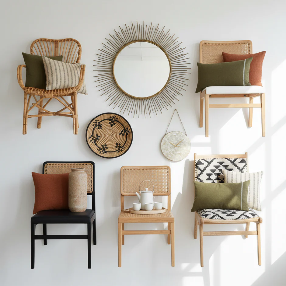
In interior design, warm colours work particularly well in social spaces — dining rooms, living rooms, and kitchens — where energy and conversation are welcome. A single piece of wall art with strong warm tones can shift the entire emotional register of a room without changing a single piece of furniture.
Cool Colour Spectrum: Emotions of Tranquillity
In contrast, cool colours like blue, green, and purple communicate more subdued, reflective emotional landscapes. These colours represent:
- Blue: Calmness, trust, stability, introspection
- Green: Growth, harmony, natural balance, renewal
- Purple: Royalty, spirituality, mystery, creativity
Cool colours often create a sense of depth, distance, and contemplative mood. They invite viewers into more nuanced emotional experiences, suggesting serenity and emotional complexity.
For bedrooms and reading spaces, cool-toned wall art is one of the most effective ways to encourage a sense of calm without repainting the walls. A soft blue or sage green print can lower the visual temperature of a room and make it feel noticeably more restful, even in a space that already has neutral walls.

This comparison table outlines the main differences between warm and cool colours in art, illustrating their typical emotional effects and uses within visual compositions.
| Colour Spectrum | Example Colours | Associated Emotions | Common Artistic Effects |
|---|---|---|---|
| Warm | Red, orange, yellow | Energy, passion, happiness, excitement | Draws attention, creates tension |
| Cool | Blue, green, purple | Calm, introspection, harmony, tranquillity | Provides depth, suggests distance |
Discover how to integrate these colours harmoniously in your living spaces
Understanding these colour associations allows us to decode the intricate emotional language of visual art, revealing how artists strategically use colour to communicate beyond words.
The following table summarises the psychological and cultural meanings of common colours in art, highlighting how each hue can convey various emotions and symbolism depending on context.
| Colour | Typical Emotional Associations | Cultural Symbolism (Selected Examples) |
|---|---|---|
| Red | Passion, anger, excitement, danger | Luck, prosperity (Chinese); Danger, passion (Western) |
| Orange | Creativity, enthusiasm, adventure | Vitality, spirituality (varies across cultures) |
| Yellow | Happiness, optimism, intellect | Divinity (Buddhist); Caution (Western) |
| Blue | Calmness, trust, introspection | Stability (Western); Immortality (East Asia) |
| Green | Growth, harmony, renewal | Fertility (Islamic); Luck (Western and Asian) |
| Purple | Royalty, spirituality, creativity | Royalty (European histories); Spirituality (varies across indigenous cultures) |
| White | Purity, simplicity | Purity (Western); Mourning (some Eastern traditions) |
The Role of Culture and Text in Colour Perception
Colour perception is far more than a universal visual experience; it is a complex interplay between individual psychological responses, cultural conditioning, and contextual interpretations. What might signify joy in one cultural context could represent mourning in another, revealing the intricate layers of chromatic communication.
Cultural Symbolism in Art Color Meaning
Research from Edge Hill University highlights the profound variations in colour symbolism across different cultural landscapes. These nuanced interpretations demonstrate how colour meanings are not absolute but deeply embedded in societal narratives:
- White: Symbolises purity in Western cultures, but represents mourning in some Eastern traditions
- Red: Represents luck and prosperity in Chinese culture, while signifying danger or passion in Western contexts
- Purple: Associated with royalty in European histories, but carries different spiritual meanings in indigenous cultures
These differences matter enormously when choosing art for a home that reflects your own cultural background or when gifting art to someone from a different tradition. A colour that feels celebratory to one person may carry entirely different associations for another, which is why understanding the cultural dimension of colour adds real depth to how we engage with art.
Contextual Interpretations of Colour
Beyond cultural boundaries, the meaning of colours shifts dramatically depending on specific contexts. An identical shade can communicate entirely different emotional states based on its surrounding environment, compositional placement, and accompanying visual elements. Learn how to navigate colour complexity in your home design.
Understanding these nuanced interpretations allows us to appreciate colour as a dynamic, living language that transcends simple visual perception, inviting deeper comprehension of human emotional and cultural experiences.
A deep navy blue in a painting surrounded by warm gold tones reads as rich and luxurious; the same navy in a composition of cool greys and whites feels stark and melancholic. The colour hasn't changed — its context has. This is one of the most important principles to carry with you when choosing art for your home.
Using Colour in Art and Design for Desired Effects
Colour manipulation represents a sophisticated artistic strategy where creators intentionally select and arrange chromatic elements to provoke specific emotional and psychological responses. This deliberate approach transforms colour from a mere visual component into a powerful communication tool capable of guiding viewer perception and experience.

Emotional Orchestration Through Colour
Research from the University of Leeds demonstrates how artists strategically employ colour to generate precise emotional landscapes. Different chromatic techniques allow creators to:
- Create Mood: Soft pastel tones generate tranquillity, while intense saturated colours generate excitement
- Direct Attention: Warm colours advance visually, drawing immediate viewer focus
- Communicate Narrative: Colour progression can represent emotional journeys or psychological transformations
This is why the same room can feel completely different depending on the wall art you choose, even if the furniture, lighting, and layout remain unchanged. A print dominated by warm terracotta and gold will make a neutral room feel grounded and energised; swap it for a cool blue and grey composition and the same space becomes calm and contemplative.
Strategic Colour Composition
Professional artists and designers understand that colour interaction matters more than individual hue selection. Complementary colours, analogous palettes, and careful tonal balancing enable nuanced emotional communication. Our guide on professional colour composition techniques for living spaces can help you create intentional, emotionally resonant environments.
By understanding colour as a dynamic, communicative medium, creators can craft visual experiences that transcend simple aesthetic appreciation, inviting viewers into profound emotional dialogues through strategic chromatic language.
When choosing wall art for your home, it's worth asking not just “do I like this?” but “how does this make me feel, and is that the feeling I want in this room?” That shift in thinking — from decoration to emotional intention — is what separates a beautiful room from one that truly feels like yours.

Bring the Meaning of Colour into Your Space with Thoughtful Wall Art
Have you ever struggled to find the right balance of emotion and style in your home or office decor? Many readers feel uncertain when translating the powerful symbolism and emotional depth of colour into real-world environments. It can be overwhelming deciding how to use red for energy or blue for tranquillity, especially if you want your walls to reflect your mood or personal story without making costly or time-consuming mistakes.

At About Wall Art, we make it easy to bridge this gap. Our curated wall art collections help you harness the language of colour, transforming spaces through carefully chosen artworks that carry the emotional resonance you have just read about. You can find practical tips in our contemporary colour trends guide and learn how specific shades create particular moods before you choose the perfect art piece. Ready to make your decor more intentional and emotionally expressive? Visit About Wall Art now and surround yourself with colours that speak directly to how you want to feel every day.
People Also Ask…
Q: What colour in art represents sadness?
A: Blue is the colour most consistently associated with sadness in art, particularly cool, desaturated shades of blue-grey or slate. Artists from Picasso during his Blue Period to contemporary painters have used these tones to evoke melancholy, longing, and introspection. Muted greens and greys are also used to suggest sadness or emotional withdrawal, especially when combined with low contrast and minimal warm tones. The absence of warm colour in a composition is often as expressive as the presence of cool colour.
Q: How does colour affect the mood of a room?
A: Warm colours — reds, oranges, and yellows — make a room feel energised and sociable, whilst cool colours — blues, greens, and purples — create a calmer, more restful atmosphere. Neutral tones like beige, grey, and white provide a flexible base that takes on the emotional character of whatever accent colours or artwork you introduce. Wall art is one of the most effective ways to shift a room's mood without repainting, because a single large print can introduce enough colour to change how the space feels. Choosing art with intention — based on the emotion you want the room to evoke — is more reliable than choosing purely on aesthetic preference.
Q: What does the colour red mean in art?
A: Red in art most commonly signifies passion, danger, urgency, or power, though its precise meaning depends heavily on cultural context and compositional placement. In Western art, red is frequently used to draw the eye, signal importance, or create emotional tension. In Chinese cultural tradition, red carries associations of luck, celebration, and prosperity. When red appears in small quantities within a composition, it acts as a focal point; when it dominates, it creates an overwhelming sense of intensity or drama.
WATCH: Painting Accurate Values — The Relationship Between Value and Color
Pro Tips
Here are three blog articles from the About Wall Art Content Hub that relate to colour, emotion, and design balance:
-
Mesmerising Spaces: Elevate Your Space with Teal Color Wall Art — shows how teal (a mix of blue & green) combines calmness and creativity, perfect for understanding how blended cool colours work.
-
Bohemian Bliss: Elevate Your Space with Bohemian Art Wall — explores vibrant colour palettes, textures and patterns, and how emotional expression can be woven into decor.
-
How to Effortlessly Mix and Blend Different Art Style Types in a Living Room — practical guidance on combining styles and colour palettes for a cohesive, expressive space.
More about
For a thorough overview of how colour shapes emotion and behaviour, Verywell Mind's guide to colour psychology covers the science and cultural context in accessible detail.


