

Color Psychology in Art: Understanding How Shades Shape Emotion
por Mae Osz en Dec 03, 2025
Have you ever noticed how color psychology in art can instantly shift the way you feel the moment you walk into a room?
Maybe you’ve stepped into a space and felt an unexpected sense of calm, or perhaps a spark of energy that lifted your mood.
That emotional response is no coincidence—it's the incredible power of colour at work. When we choose art intentionally, we’re not just decorating; we’re shaping how our homes make us feel on a deeper, more meaningful level.
This blog is all about exploring how colour influences emotion so you can create a home that feels soothing, inspiring, and uniquely you.
List of Contents
- The Emotional Power of Colour in Your Home
- The Science Behind Colour and Feeling
- The Influence of Warm Colours: Reds, Oranges, and Yellows
- The Serenity of Cool Colours: Blues, Greens, and Purples
- The Grounding Power of Neutral Tones
- Applying Color Psychology in Art to Your Home Decor
- How Artists Use Colour to Tell a Story
- More about…
- Pro Tips…
The Emotional Power of Colour in Your Home
I believe our homes should be our sanctuaries. They are the places we return to for comfort, inspiration, and rest.
Understanding color psychology in art is a wonderful tool for transforming a house into a home that truly nurtures our emotional wellbeing. It’s not an abstract theory, but a practical way of thinking about the emotional impact of colour in decor. When I help people choose art, we often talk about the feeling they want to create.

Here in the UK, where we have our fair share of grey, overcast days, bringing vibrant and emotionally resonant art into our interiors can be a powerful antidote. It’s about using wall art for mood setting, making your space a reflection of the atmosphere you want to live in.
This is the real magic of how to decorate with art intentionally.
The Science Behind Colour and Feeling
So, why does colour have such a hold on us? It’s a fascinating mix of science and personal experience.
In simple terms, our eyes perceive different colours as varying wavelengths of light. Our brains then translate these signals into emotional and sometimes even physiological responses.
For instance, research suggests that red can provoke feelings of passion and urgency, while blue is often associated with tranquillity, as noted by galleries like Byard Art.
Some of these associations are universal; green often reminds us of nature and renewal. However, our connection to colour is also deeply personal, tied to memories and cultural backgrounds.
A certain shade of yellow might remind one person of a happy childhood holiday, while for another it has no special meaning. Understanding this basic science is the first step in using the principles of color psychology in art with purpose.
The Influence of Warm Colours: Reds, Oranges, and Yellows
Let’s talk about the energetic side of the spectrum. Warm colours like red, orange, and yellow are often described as ‘advancing’ colours because they appear to come forward, making a space feel more intimate and cosy. They are brilliant for injecting passion, joy, and social energy into a room.
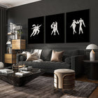
Red is the colour of passion and can be a fantastic focal point in social areas like dining rooms or living rooms.

Orange is associated with creativity and enthusiasm, making it a great choice for a home office or kitchen where you want to feel inspired.

Yellow is pure happiness and optimism, perfect for hallways or any space that could use a dose of sunshine. A piece with bold red strokes can become the heart of your social space, and you can find many beautiful framed wall pictures for the living room that do just that.

A practical tip for applying colour psychology in art is to use these powerful shades as accents within artwork to avoid overwhelming a room.
The Serenity of Cool Colours: Blues, Greens, and Purples
On the other side of the wheel, we have the cool colours.
Blues, greens, and purples are ‘receding’ colours, which means they can make a space feel larger, more open, and incredibly tranquil.
They connect us to natural elements like the sky, the sea, and lush forests, which is why they have such a calming effect.
Blue is the ultimate colour for serenity and rest, making it a classic choice for bedrooms and bathrooms.

Green promotes balance and renewal, ideal for bringing a touch of nature indoors to reduce stress. This is why so many of us are drawn to blue and green wall art for a bedroom; it instinctively helps us unwind.

Purple has a sense of luxury and contemplation, perfect for a quiet reading nook. Using this knowledge of color psychology in art empowers you to build a peaceful retreat within your own home.
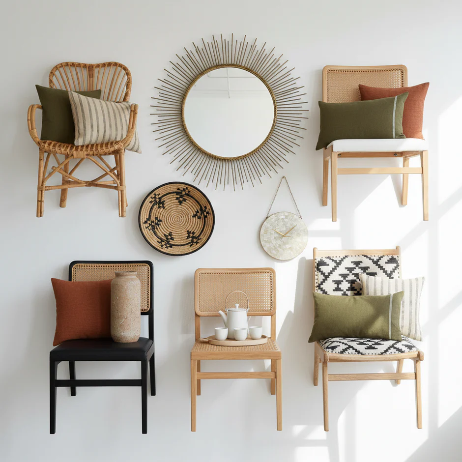
The Grounding Power of Neutral Tones
We can’t forget the unsung heroes of the colour wheel: the neutrals.
Whites, greys, beiges, and earthy tones are the foundation that allows other colours to shine. Art dominated by these shades can create a feeling of timeless elegance, sophistication, and profound calm.

This aesthetic is at the heart of popular UK interior styles like Scandinavian and Japandi. Neutrals are incredibly versatile.
A piece of art with a neutral palette can be a subtle, textured statement on its own, or it can act as a quiet anchor for more vibrant decor elements in the room. For a truly serene and minimalist feel, exploring a collection of neutral wall art can provide the perfect foundation for your room's design.

This demonstrates a more advanced use of color psychology in art, showing that quiet colours can speak volumes.
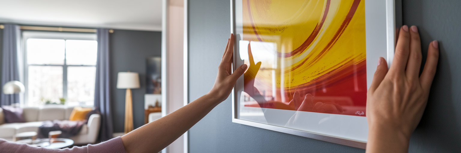
Applying Color Psychology in Art to Your Home Decor
This is where the principles of color psychology in art truly come to life. Think of it as a guide to curating the mood of your home, room by room.
Every space has an emotional purpose, and the right art can help define it.
When you are choosing art for your home, consider not just the style but the feeling you want to evoke.

A great way to start is by browsing wall art by colour scheme to see which palettes you're naturally drawn to for each space. This is a key part of understanding color psychology in art in a practical sense.
| Room | Desired Mood | Recommended Colours in Art | Why It Works |
|---|---|---|---|
| Living Room | Social, Welcoming, Energetic | Yellows, Oranges, or a mix of Blue & Orange | Warm tones encourage conversation and create a cosy, inviting atmosphere. |
| Bedroom | Calm, Restful, Serene | Soft Blues, Greens, Lavender, Neutral Tones | These colours are linked to nature and calm, helping to lower stress and promote sleep. |
| Kitchen | Uplifting, Fresh, Appetising | Greens, Yellows, Earthy Oranges, Reds | Greens and yellows feel fresh and vital, while reds can stimulate appetite. |
| Home Office | Focused, Creative, Balanced | Green, Blue, with accents of Yellow or Orange | Green aids concentration, while a splash of warm colour can boost creativity and fight fatigue. |
This table offers a starting point for curating the mood in each room. Remember, these are guidelines—the most important factor is choosing art that you personally love and connect with.
How Artists Use Colour to Tell a Story
Artists are masters of color psychology in art, using it deliberately to guide our emotions and tell a story without words. When you look at a piece of art, you can often see these techniques at play. This is a fascinating aspect of color psychology in art. Two key approaches are:
- Analogous Colours: These are colours that sit next to each other on the colour wheel, like blue and green. Artists use them to create a sense of harmony and peace.

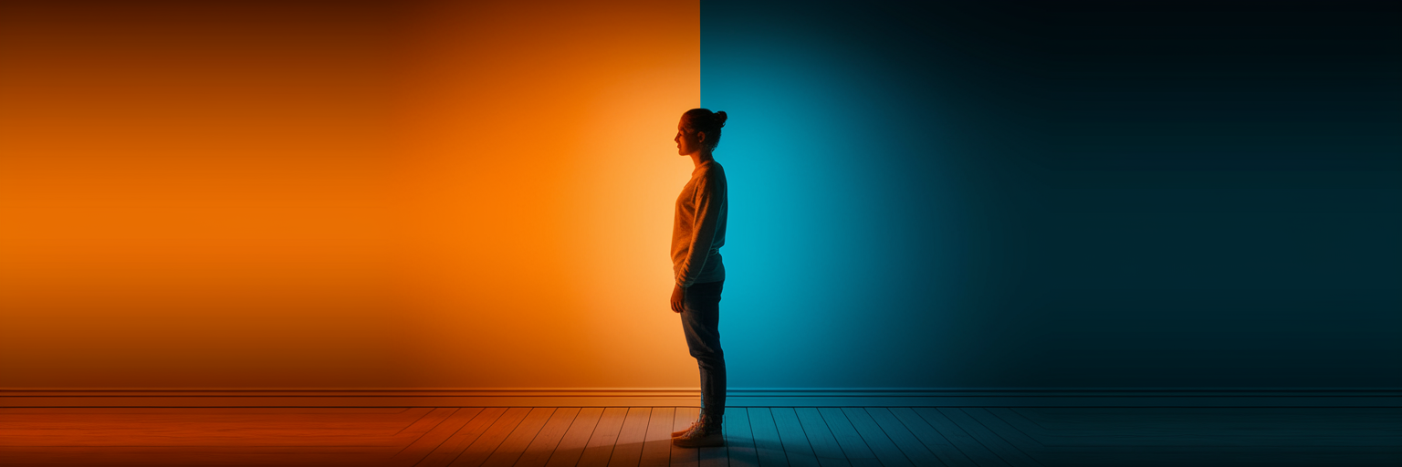
- Complementary Colours: These are opposites on the colour wheel, like blue and orange. They create high contrast and a feeling of energy and drama.

You can see this masterfully at play in many pieces of abstract art prints, where colour is the main storyteller.
Next time you view a piece, ask yourself: does this feel calm or energetic? Harmonious or dramatic? This will help you make more informed choices.
More about…
Embark on a journey of emotional expression through colour. Learn how to choose art that speaks to your soul. Join us as we explore the topic of Color Psychology in Art: Understanding How Shades Shape Emotion. Click here to uncover more inspiration and tips for decorating your personal sanctuary.
Pro Tips…
Visual Inspiration from Our Content Hub
If you want to see these ideas in action, our Content hub offers plenty of visuals to guide you. Discover inspiring Home decor tips and trends to suit a variety of styles and moods. This is a great way to see color psychology in art applied in real settings.
- Inspiring Prints for Your Living Room
- Greige colours: How to decorate with the Timesless blend of grey & Beige
- Understanding art colour meaning: Emotions & Symbolism
I hope this guide inspires you to view wall art as both a decorative element and a powerful tool for creating a sanctuary tailored to your relaxation needs. Which style are you leaning towards? Let me know—I’d love to hear your ideas!


