
Stylish Prints for Living Room: Inspire Your Space
by Mae Osz on Aug 16, 2025
Have you ever walked into your living room and felt it was missing something — even though all the furniture was in place? I’ve seen it happen many times, and it’s often not about the sofa, the rug, or the coffee table. It’s about what’s on the walls. The right prints for living room spaces don’t just fill empty spots — they can change the way you feel in your home.
One of my favourite tricks is using artwork that covers around two-thirds to three-quarters of the sofa’s width. Instantly, it creates balance, proportion, and a focal point that draws the eye. But the magic doesn’t stop there. Tasteful prints tell your story. They whisper it to every guest, subtly shaping the mood of the room without saying a word.
List of Contents
-
Choosing the Right Prints for Living Room Walls
-
Understanding Colour Psychology in Wall Art
-
Sizing and Placement Strategies
-
Harmonising Art with Your Living Room’s Aesthetic
-
Popular Print Styles and How to Pair Them
-
Display Tips: Arranging Prints for Maximum Impact
-
Caring for and Preserving Art Prints at Home
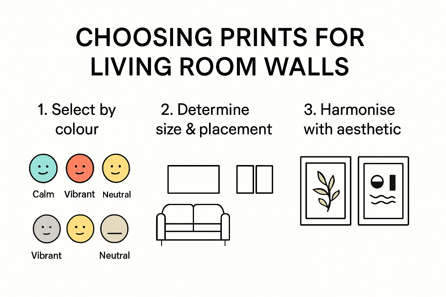
Choosing the Right Prints for Living Room Walls
When I help someone choose prints for living room spaces, I always start by asking, “What do you want to feel when you walk in here?” That question shapes everything. Your living room should be your retreat — a place where your personality flows into the walls.

The process is personal, but having a few strategies in mind can make it easier. For example, I’ve worked with clients who thought they wanted bright, busy prints, only to realise that softer tones suited their style better once the pieces were on the wall. This is why I suggest taking your time, looking at your existing furniture, colours, and textures, and finding prints that complement rather than compete.
If you love the look of printed wall art but want a frameless, gallery-ready finish, take a look at our full guide to canvas paintings for living room spaces, where we cover sizing, colour psychology, and hanging tips in detail.
Understanding Colour Psychology in Wall Art
Colour can transform a room’s atmosphere almost instantly. I’ve read research on image colour transfer that shows how certain hues affect our mood.
Cool blues and greens bring calm — perfect for unwinding after a long day. Warm tones like orange and red create energy, ideal for rooms where you host and socialise. Neutral palettes? They’re your best friend if you want a versatile, sophisticated look that won’t overpower your furniture.

Here’s a quick reference I often share with clients:
| Print Feature | Impact on Atmosphere | Best Placement/Usage |
|---|---|---|
| Cool blues and greens | Creates calm, relaxing environment | Social or relaxing spaces |
| Warm oranges and reds | Adds vibrancy and energy | Lively, social areas |
| Neutral colour gradients | Sophisticated, versatile look | Matches various interior styles |
| Large statement print | Dramatic focal point, anchors room | Above sofa, covering two-thirds of its width |
| Collection of smaller prints | Tells a narrative, adds interest | Gallery wall, various arrangements |
| Minimalist geometric prints | Modern, clean aesthetic | Contemporary furniture settings |
| Classic landscape/portrait | Timeless elegance | Traditional or classic room decor |
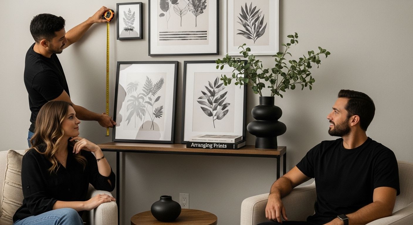
Sizing and Placement Strategies
I’ve lost count of how many times I’ve seen beautiful prints hung in the wrong size or place. According to design experts at Engineers and Architects of America, art should anchor the room visually.
For most prints for living room arrangements, aim for a piece that covers about two-thirds the width of your sofa. For large walls, I love creating gallery walls with a mix of small and medium prints — it gives depth and personality.

And here’s a tip I swear by: lay your chosen prints on the floor in front of the wall first. You’ll quickly see if the scale feels right before committing to nails or hooks.
Harmonising Art with Your Living Room’s Aesthetic
Plank and Pillow puts it perfectly — your prints should enhance your living room’s style, not fight against it. If you have clean, contemporary furniture, go for abstract or geometric designs. If your space is more traditional, landscapes or portraits might feel right at home.
I’ve also found that materials make a difference. A canvas print feels casual and relaxed, framed fine art feels polished, and metal prints can add a modern industrial touch. Remember: the art should make you happy first and foremost.
Popular Print Styles and How to Pair Them
Exploring different prints for living room styles can be a joy in itself. Each has its own personality and can set a completely different tone.
Contemporary and Abstract Prints for Living Room
Abstract art breaks rules — and that’s why I love it. Research on visual pairing suggests keeping a shared element, like a common colour tone, to make abstract pieces feel cohesive with the rest of your decor.
 SHOP HERE
Classic and Vintage Print Styles
Vintage prints — from black-and-white photography to historic illustrations — bring charm and a sense of history. Mixing frame styles here works beautifully; an ornate gold frame next to a simple wood frame adds depth and variety.
Nature and Photographic Prints for Living Room
Nature photography is endlessly versatile. I once hung a misty forest scene in a modern loft, and it completely softened the space. Pay attention to colour — greens and blues calm, while tropical brights energise.
Here’s a pairing summary for quick reference:
| Style / Print Type | Visual Characteristics | Pairing Suggestions |
|---|---|---|
| Contemporary / Abstract | Bold forms and colours | Minimalist spaces, match decor tones |
| Classic / Vintage | Landscapes, old photos | Curated gallery wall, mix frame styles |
| Nature / Photography | Organic, natural imagery | Any style; focus on mood and colour palette |
Display Tips: Arranging Prints for Maximum Impact
Placement is everything. Better Homes & Gardens recommends hanging art at eye level, around 57 inches from the floor. I follow this almost every time unless the room calls for a creative break from tradition.
When arranging multiple pieces, balance visual weight. Larger prints look best anchored low or to one side, with smaller ones arranged around them. Odd numbers often feel more natural and interesting than even groupings.
If you’re building a gallery wall, 1stdibs suggests starting with a central anchor piece and expanding outwards. Mix in mirrors or small wall sculptures for variety.
Caring for and Preserving Art Prints at Home

Art deserves care. The Canadian Conservation Institute advises wearing cotton gloves when handling prints to avoid transferring oils from your hands. Always support the whole piece and avoid touching the image surface.
Light can fade colours over time, so position prints away from direct sunlight or use UV-filtering glass. As University of Southern Indiana suggests, keeping temperature and humidity stable is just as important.
Dust frames with a soft cloth, and never spray cleaner directly on the artwork. If you notice damage, consult a conservator — they’re the best people to restore delicate pieces.
Environmental Preservation Strategies
The University of Southern Indiana reminds us that where you place your prints is just as important as how you display them. Light — whether it’s streaming through a window or from a bright lamp — can cause colours to fade over time. I’ve seen gorgeous prints lose their vibrancy simply because they were hung in direct sunlight.
If you can, position your prints for living room areas away from harsh light sources. When they’re near windows, think about adding UV-filtering film to the glass or placing them somewhere they’ll get softer, indirect light instead. Just as important is keeping your space at a steady temperature and humidity level. Rooms prone to damp, extreme heat, or constant temperature changes can shorten the life of your prints.
Cleaning and Maintenance Protocols
The North Carolina Museum of History offers some excellent advice that I’ve adopted myself: gentle is always best. For day-to-day dusting, use a soft, lint-free cloth and work carefully around the edges of the frame. Avoid spraying liquid cleaners directly onto the print or the frame — moisture can sneak behind the glass and cause damage.
If your print is framed, clean the protective glass or acrylic covering lightly, making sure no water or cleaning solution touches the print itself. For valuable or antique pieces, I recommend getting them cleaned by a professional. It’s an investment that can save you from costly restoration later.
Make it a habit to check your prints every so often for any signs of discolouration, mould, or even tiny insect damage. Spotting problems early means you can act quickly, often preventing bigger issues. If something doesn’t look right, reach out to an art conservator — they’ll know exactly how to help without risking further harm.
Here’s a simple checklist you can follow to keep your prints looking their best:
| Care Step | Action | Why It Matters |
|---|---|---|
| Placement | Keep away from direct sunlight or harsh artificial light | Prevents fading and colour loss |
| UV Protection | Use UV-filtering window film or indirect lighting | Reduces damage from light exposure |
| Temperature & Humidity | Keep stable, avoid extremes | Protects paper and colours |
| Dusting | Use a soft, lint-free cloth | Avoids scratches and marks |
| Avoid Liquids | Don’t spray cleaner directly on frame or print | Prevents moisture damage |
| Regular Checks | Inspect for mould, fading, or insect activity | Early action stops deterioration |

Pro Tips…
Visual Inspiration from Our Content Hub
If you want to see these ideas in action, our Content hub offers plenty of visuals to guide you. Discover inspiring home décor tips and trends to suit a variety of styles and moods.
Here are some related reads I recommend:
I hope this guide inspires you to view prints for living room arrangements as more than just decoration. They’re an opportunity to tell your story, set your mood, and make your home uniquely yours.
Which style are you thinking of trying first?


