

Have you ever wondered why some rooms instantly make you feel calmer while others seem to drain your energy? The secret often lies in soothing color palettes. They do far more than decorate your walls.
Colour has the power to shape how we feel, how we work, and even how we connect with the people around us. While many of us choose shades based on personal taste or the latest design trends, psychological research tells a much deeper story.
Certain hues can lower heart rates, ease stress, and create an atmosphere where relaxation comes naturally. The real magic is that with the right palette, any room can be transformed into a sanctuary for mental well-being—and the science behind it is more fascinating than you might expect.
Table of Contents
- Understanding The Psychology Of Colours
- The Best soothing Color Palettes For Relaxation
- Warm Nurturing Colour Combinations
- Nature-Inspired Palettes For Serenity
- Minimalistic Colour Schemes For Modern Spaces
- How To Use Accent Colours Effectively
- Tips For Choosing Colours For Different Rooms
Quick Summary
| Takeaway | Explanation |
|---|---|
| Choose colours based on emotional impact. | Different colours evoke specific emotions; select hues that foster the desired atmosphere in your space. |
| Use cool colours for relaxation spaces. | Cool tones like blue and green promote calmness, ideal for bedrooms and offices to enhance tranquility. |
| Incorporate warm colours for social areas. | Warm hues encourage engagement and comfort, perfect for living rooms to foster connection and conversation. |
| Design with nature-inspired palettes. | Natural colour combinations can enhance emotional well-being and create a grounded atmosphere that soothes the mind. |
| Establish room-specific colour schemes. | Tailor colour choices to the function of each room, considering how they influence emotions and functionality. |
1: Understanding the Psychology of Colours
Colour is far more than a visual experience—it’s an emotional language that speaks directly to our subconscious. When we select soothing colour palettes for our living and working spaces, we’re essentially crafting an environment that communicates tranquillity, energy, and personal expression.
Psychological research reveals that colours profoundly influence our emotional states and cognitive responses. According to a systematic review of colour psychology research, humans consistently associate specific colours with emotional experiences. These associations are deeply rooted in our evolutionary and cultural experiences.
Key insights into colour psychology include:
-
Warm colours like red and orange tend to stimulate excitement and high-energy emotions
-
Cool colours such as blue and green typically evoke feelings of calmness and relaxation
-
Neutral tones like beige and grey can create a sense of balance and stability
The ecological valence theory suggests that our colour preferences emerge from our accumulated emotional experiences with objects associated with those colours. For instance, someone who loves clear blue skies might naturally gravitate towards blue tones in their interior design.
When creating soothing colour palettes, understanding these psychological nuances becomes crucial. It’s not just about aesthetic appeal, but about creating an environment that supports emotional well-being and promotes a sense of harmony.
By consciously selecting colours that resonate with our inner emotional landscape, we transform spaces from mere physical environments into supportive, nurturing sanctuaries. Whether you’re designing a home office, living room, or bedroom, the right colour palette can significantly influence mood, productivity, and overall sense of comfort.

2: The Best soothing Color Palettes for Relaxation
Cool colour palettes offer a serene gateway to creating spaces that breathe tranquillity and promote emotional well-being. When we select soothing colours from the blue and green spectrum, we invite a sense of calm that transforms our living and working environments.
According to research, blue and green hues are scientifically proven to evoke feelings of relaxation and peace. These cool tones work like visual therapy, reducing stress and creating an atmosphere of gentle restoration.
Key cool colour palette combinations include:
-
Sage Green and Soft Grey: A sophisticated blend that mimics natural landscapes
-
Ocean Blue and Pale Ivory: Reminiscent of serene coastal environments
-
Mint Green and Dove White: A fresh, clean palette that feels light and airy

When designing with these palettes, consider how different shades interact. Soft, muted tones work best for creating a truly relaxing environment. Think of colours that whisper rather than shout—gentle gradients that flow seamlessly and create a sense of visual harmony.

The psychological impact of these cool colours extends beyond aesthetics. They can lower heart rate, reduce anxiety, and create a sense of spaciousness. By strategically incorporating these soothing colour palettes, you’re not just decorating a space—you’re curating an environment that supports mental and emotional well-being.
Remember that personal connection matters most. While scientific research provides guidance, your individual response to a colour palette is paramount. What feels calming to one person might feel different to another. Trust your instincts and create a space that genuinely speaks to your sense of peace and comfort.
3: Warm Nurturing Soothing Color palettes Combinations
Warm colour palettes radiate an inherent sense of comfort, transforming spaces into welcoming sanctuaries that embrace and nurture our emotional well-being. Unlike cool tones, warm colours communicate intimacy, energy, and connection.
According to research, warm colours like red, orange, and yellow can stimulate engagement and create dynamic environments that inspire action and conversation.
Key warm colour combinations that evoke nurturing emotions include:
-
Terracotta and Soft Cream: Reminiscent of Mediterranean landscapes
-
Burnt Sienna and Warm Beige: Creating a sense of earthen comfort
-
Peach and Dusty Rose: Soft, gentle tones that feel inherently comforting
Psychological impact plays a significant role in selecting warm colour palettes. These hues trigger emotional responses that can make spaces feel more intimate and supportive. The subtle interplay between different warm tones allows for creating environments that feel simultaneously energetic and soothing.
When designing with warm colours, subtlety is key. Muted, sophisticated shades work best—think rich, complex tones that whisper rather than shout. Avoid oversaturated colours that might feel overwhelming or aggressive.

Interestingly, warm colour preferences can vary based on personality. More extroverted individuals often gravitate towards brighter, more saturated warm tones that reflect their dynamic energy. Introverts might prefer softer, more subdued warm palettes that provide a gentle sense of comfort.

Ultimately, the goal of warm nurturing colour combinations is to create spaces that feel like a metaphorical embrace—environments that welcome, support, and gently inspire those who inhabit them.
4: Nature-Inspired Soothing color palettes for Serenity
Nature-inspired soothing color palettes offer a profound connection to the natural world, transforming interior spaces into tranquil sanctuaries that soothe the soul and calm the mind. By drawing directly from Earth’s most harmonious tones, we create environments that resonate with our deepest sense of peace.
According to research, biophilic color influences can significantly reduce stress and enhance emotional well-being by subtly mimicking natural landscapes and organic elements.
Ideal nature-inspired soothing colour palettes include:
-
Moss Green and Soft Stone Grey: Reflecting forest floor tranquillity
-
Sandy Beige and Seafoam Blue: Evoking coastal serenity
-
Warm Terracotta and Olive Green: Capturing desert and woodland harmony

Biophilic design principles suggest that integrating colours directly inspired by natural environments can profoundly impact our psychological state. These palettes work by triggering subconscious memories of peaceful outdoor experiences, creating a sense of grounding and emotional stability.
The power of nature-inspired colours lies in their ability to blur indoor boundaries, making spaces feel more expansive and connected to the external world. Soft, muted tones that echo landscapes—from misty mountain ranges to gentle coastal scenes—invite a sense of calm and contemplation.

When selecting nature-inspired palettes, consider texture as well as colour. Natural materials like wood, stone, and organic fabrics can amplify the soothing effect, creating multisensory environments that feel authentically connected to the natural world.
Ultimately, these palettes are more than mere decorative choices. They represent a deliberate approach to creating spaces that nurture, restore, and connect us to the profound tranquillity found in nature’s most elegant colour compositions.
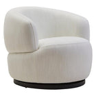
5: Minimalistic Soothing Color Palettes Schemes for Modern Spaces
Minimalistic soothing color palettes schemes represent a deliberate approach to interior design, focusing on simplicity, clarity, and intentional visual harmony. These palettes strip away unnecessary complexity, creating spaces that breathe tranquillity and promote mental clarity.
According to research, minimalist interior design emphasizes neutral or earthy colour schemes that create serene and functional environments.
Key principles of minimalistic colour palettes include:
-
Monochromatic White and Grey: Creating a sense of spaciousness and calm
-
Soft Ivory and Taupe: Providing warmth without visual clutter
-
Pale Blue and Dove White: Introducing subtle depth and tranquillity
Psychological considerations play a crucial role in minimalist design. By reducing visual noise, these colour schemes allow the mind to relax and focus. The deliberate use of negative space becomes as important as the colours themselves, creating a sense of intentionality and peace.

Minimalist colour palettes work by employing a restrained approach to chromatic expression. Instead of multiple competing tones, these schemes rely on subtle variations and texture to create visual interest. Think of it as visual meditation—each colour and element serves a specific purpose, eliminating unnecessary distractions.
Texture becomes paramount in minimalist spaces. A pale grey wall paired with soft linen curtains, a crisp white ceramic vase, or a smooth wooden surface can create depth and interest without overwhelming the senses. The goal is to create a space that feels both deliberate and effortless.
Ultimately, minimalistic colour schemes are about creating environments that support mental clarity, reduce stress, and provide a canvas for personal expression. They invite us to breathe, think, and exist in spaces that feel both calm and intentionally designed.
6: How to Use Accent Colours Effectively
Accent colours are the secret weapon of sophisticated interior design, offering a powerful means to inject personality, create visual interest, and guide the eye through a space. When used thoughtfully, these strategic pops of colour can transform an ordinary room into an extraordinary environment.
According to research, primary colours should remain predominant, with accent colours used sparingly for emphasis and visual intrigue.
Key strategies for using accent colours include:
-
The 60-30-10 Rule: 60% dominant colour, 30% secondary colour, 10% accent colour
-
Complementary Colour Placement: Choose colours opposite each other on the colour wheel
-
Emotional Resonance: Select accent colours that evoke desired feelings or moods


Psychological precision is crucial when introducing accent colours. These vibrant elements should not overwhelm but rather enhance the overall colour harmony. Think of accent colours like punctuation in a beautifully written sentence—they draw attention, create emphasis, and add narrative depth.
Consider placement carefully. An electric blue throw pillow in a neutral grey room, a mustard yellow artwork against a sage green wall, or copper light fixtures in a white kitchen can create stunning focal points that elevate the entire design.
Texture plays a significant role in accent colour effectiveness. A rich emerald green velvet cushion will create a different impact compared to the same colour in a silk finish. Varying textures allows accent colours to feel more nuanced and sophisticated.
Remember that accent colours are not just about visual drama—they’re about creating emotional resonance. The right accent can transform a space from merely functional to deeply personal, telling a story through carefully chosen chromatic whispers.
7: Tips for Choosing Colours for Different Rooms
Choosing the right colours for each room requires understanding how different spaces serve unique psychological and functional purposes. Your colour palette should not just look beautiful, but support the room’s intended atmosphere and emotional experience.
According to research, different rooms demand distinct colour approaches based on their primary functions and emotional requirements.
Key colour considerations for specific rooms include:
-
Bedroom: Soft, calming blues and muted greens for relaxation

-
Home Office: Neutral greys with energetic blue accents for focus

-
Living Room: Warm neutrals with flexible accent colours for social interaction

Natural light plays a crucial role in colour selection. Rooms with abundant sunlight can support deeper, richer tones, while spaces with limited light might benefit from lighter, more reflective colours that create an illusion of openness.
Psychological function matters tremendously. A kitchen might use energetic yellows to stimulate appetite and conversation, whereas a bathroom could incorporate serene spa-like blues to create a sense of cleansing and tranquillity. The bedroom demands particular attention, as its colours directly impact sleep quality and emotional restoration.
Texture becomes an essential companion to colour in room-specific design. A soft sage green with textured linen curtains will feel entirely different from the same colour painted on smooth walls. Consider how light, texture, and colour interact to create the desired emotional landscape.
Remember that colour is not just visual—it’s an experience. Each room tells a story, and its colour palette is the narrative’s foundation. Choose wisely, and your home becomes a symphony of emotional and functional harmony.
Below is a comprehensive table offering a clear summary of the articles main ideas, practical palette suggestions, and the psychological benefits of each approach to soothing colour schemes for homes and offices.
| Key Area | Main Points | Benefits/Outcomes |
|---|---|---|
| Colour Psychology | Colours evoke emotional responses; understanding their impact is central to effective design. | Supports emotional well-being and creates harmony. |
| Cool Palettes for Relaxation | Use of blue, green, sage, mint, and soft greys/ivories in muted tones for tranquil settings. | Reduces stress and anxiety; promotes calm and spaciousness. |
| Warm, Nurturing Combinations | Incorporation of terracotta, peach, sienna, dusty rose in gentle, muted pairings. | Fosters comfort, warmth, and social connection. |
| Nature-Inspired Schemes | Tones drawn from nature (moss/olive green, sandy beige, seafoam blue, soft stone grey). | Enhances serenity, biophilia, and emotional grounding. |
| Minimalistic Colour Schemes | Focus on simplicity: whites, soft taupes, subtle blues, restrained monochrome with texture. | Encourages mental clarity, reduces visual clutter, and promotes focus. |
| Using Accent Colours | 60-30-10 rule, complementary accents, and emotionally resonant colour pops in careful placement. | Adds personality, creates visual interest, and highlights features. |
| Choosing for Different Rooms | Select colours by room function (e.g., calming for bedrooms, energetic for kitchens/offices). | Enhances functionality, atmosphere, and overall comfort in each space. |
Transform Your Colour Story Into Living Art
You have discovered how soothing colour palettes can truly reshape your emotional landscape at home or in the office. Yet, a common challenge remains—translating that knowledge into tangible design choices that reflect your style while also cultivating the calm, uplifting energy you crave. Whether it is building a nurturing sanctuary with warm tones or seeking mental clarity through minimalism, the real struggle is making your chosen palette come alive on your own walls.
Why settle for blank spaces when the right wall art can ignite your chosen palette and complete your environment? Explore curated collections at aboutwallart.com, where each piece is carefully selected to harmonise with modern soothing palettes. Discover art that enhances serene blues, energises with gentle warmth, or grounds your space with nature-inspired tranquillity. Now is the ideal moment to bring your colour vision to life. Let your next interior transformation begin—browse our latest arrivals and choose wall art that turns colour psychology into daily inspiration.
Get Inspired
Want more ideas and inspiration? Check out these blogs from our Content Hub:
-
Modern Wall Art Ideas to Refresh Any Space — Dive into creative wall art ideas that can transform bedrooms, offices, or any room that needs a mini-makeover.
-
How to Select the Right Picture Frames for Your Artwork — This one walks you through picking frames that enhance your art and colour scheme, without overpowering it.
-
How to Use Art On Walls to Anchor a Color Scheme — Learn how well-chosen art can reinforce the mood, palette, and style of your entire room.
More About
Want to explore the science behind how colour shapes mood and behaviour? Visit Verywell Mind’s guide to colour psychology for deeper insights into the emotional impact of colours in everyday life.


