
Choosing the right art for grey walls without making the room feel cold
by Mae Osz on Sep 16, 2025
The best art for grey walls uses warm tones — burnt orange, mustard yellow, terracotta, or earthy neutrals — combined with varied textures and proportional scale to prevent the room feeling cold and make the space feel personal and inviting.
By Mae Osz | Interior Design Consultant & Home Decor Expert with 12+ years of experience.
Key Takeaways:
- Warm-toned art — featuring burnt orange, mustard yellow, terracotta, or deep red — is the most effective way to prevent grey walls from feeling cold.
- Matching the undertone of your art to the undertone of your grey (warm grey with warm art, cool grey with carefully balanced accents) creates a more harmonious result.
- Textured art such as canvas prints with raised brushstrokes or woven wall hangings adds tactile warmth that smooth grey walls naturally lack.
- Art scale should relate to furniture — above a sofa, aim for a piece roughly two-thirds the width of the sofa to maintain visual balance.
- Matte black frames are the most versatile choice for grey walls, bridging styles from Scandinavian to mid-century modern without clashing.
- Limiting your art's colour palette to two or three tones that echo through cushions, rugs, and accessories creates a cohesive, curated look.
How do you choose the right art for grey walls without making your space feel cold or dull?
Grey walls provide the perfect neutral canvas, but selecting art for grey walls requires a careful balance to avoid making the space feel cold or dull. I often find that adding warmth through colour choices is the first step. For instance, incorporating pieces with warm tones—like burnt orange, mustard yellow, or deep reds—brings a cosy energy that contrasts beautifully against the coolness of grey. Alternatively, you can introduce natural textures such as wood frames or canvas prints with warm undertones. I've seen how this simple contrast can transform a room from stark to inviting without overwhelming the subtlety of the base colour.
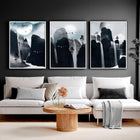
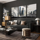
Another detail that makes a difference is scale and placement. Large, bold artworks work wonderfully on grey walls because they command attention and inject personality into the space. For example, a vibrant abstract print spanning over 1.2 metres in width can draw the eye and add dimension to a lounge area. On the other hand, a carefully curated gallery wall featuring smaller prints and photographs provides variety and rhythm, making the room feel more dynamic and lived-in. In these cases, using a mix of frame colours—such as black, white, and brass—helps complement the grey tones while keeping the look cohesive. When I choose art for grey walls, mixing these elements always inspires a space that feels both polished and personal.
List of Contents
- The Importance of Warmth: How to Combat the Cold Feel of Grey
- Understanding Colour Temperature and Its Impact
- Selecting Artwork That Invokes Warmth
- Medium Matters: The Role of Materials in Your Selection
- Textures That Bring Life to Grey Walls
- The Visual Influence of Different Art Mediums
- The Power of Scale: Finding the Perfect Size for Your Space
- Factors to Consider for Art Size
- Creating Balance with Proportional Choices
- Harmonising Themes: Creating a Cohesive Look with Grey Walls
- Complementary Themes and Colour Schemes
- How to Mix Styles Without Clashing

The Importance of Warmth: How to Combat the Cold Feel of Grey
Grey walls often risk giving a space a cool or even chilly atmosphere, especially if the shade leans more towards blue or silver tones. To soften that sensation, warmth becomes your greatest ally. You might think adding a few cushions or a throw could be enough, but when it comes to art for grey walls, the choices you make have a much bigger impact. Warmth in visuals and colours can transform the entire vibe, making your room feel inviting and comforting instead of austere.
Introducing warmth isn't only about colour temperature but also texture and mood. Art pieces that feature warm hues or tactile surfaces can bring a subtle glow to grey walls. For instance, earthy tones such as rich terracotta, golden ochre, or deep amber help combat the cold. In addition, artworks that depict natural landscapes or soft, flowing shapes tend to feel soothing, adding an element of calm that perfectly balances the neutrality of grey.
I've also found that the subject matter of the artwork matters as much as the colour. Pieces featuring human figures, cosy interiors, or warm natural scenes carry an emotional warmth that abstract colour alone can't always replicate. A painting of a sunlit kitchen or a forest in autumn light, for example, brings a lived-in feeling to grey walls that makes the whole room feel more human and welcoming.
Understanding Colour Temperature and Its Impact
Colour temperature shapes the emotional tone of a room more than we often realise. Warm colours—reds, oranges, yellows—evoke feelings of comfort and intimacy, while cool colours—blues, greens, purples—can feel refreshing but sometimes distant. Grey sits neutral on this spectrum but often reads as cold when paired with cool-toned art or lighting.

Choosing the right art for grey walls depends heavily on understanding how these colours interact. For example, warm colour accents in artwork can counterbalance the perceived "coldness" of your grey walls, adding vibrancy without overwhelming serenity. Naturally, you want to ensure that the art doesn't clash but rather enhances the existing palette by complementing that neutral base.
One practical test I use with clients is to hold a warm-toned print against the grey wall in both natural and artificial light. The way the colours shift under different lighting conditions tells you immediately whether the warmth is strong enough to hold its own, or whether you need to go bolder. It's a simple step that saves a lot of second-guessing once the art is hung.
| Warm Colours | Cool Colours |
| Reds, oranges, yellows | Blues, greens, purples |
| Evoke warmth, energy, and cosiness | Feel calm, cool, and refreshing |
| Best for adding intimacy to grey tones | Can increase the cold look if overused |
| Works well with neutral grey walls | Needs balancing with warm accents |
Selecting Art for grey walls That Invokes Warmth
Warmth in wall art doesn't just mean picking the right colours; it's about choosing pieces that invite feelings of joy and relaxation. For example, I've seen a living room with pale grey walls brought to life by an oversized canvas featuring a sunset palette—hues of burnt orange, coral, and soft gold. This artwork almost seemed to radiate warmth, making the space feel more personal and serene. Even small touches, like a set of prints with autumnal leaves or warm abstract shapes, can work wonders.
Another approach lies in the style and subject matter. Art that captures organic elements—trees, flowers, or sun-kissed landscapes—often carries intrinsic warmth. I've noticed that combining these themes with warm tones, like rusty reds or ochres, balances the coolness of grey walls while adding texture and depth to the room.
Once you find art that evokes warmth, layering with subtle lighting can further enhance the effect. Soft, warm light directed at your chosen pieces creates a cosy, inviting glow that makes your grey walls feel anything but cold. Experimenting with these layers is a game-changer when decorating spaces with grey as the foundation.

Medium Matters: The Role of Materials in Your Selection
Choosing the right medium for your art can transform grey walls from a dull backdrop into a captivating feature. I've found that materials like canvas, metal, or even glass offer unique qualities that interact differently with grey tones. For instance, a matte canvas piece tends to soften the room's feel, adding warmth without overwhelming. On the other hand, metal prints can inject a modern edge, their reflective surfaces bouncing light around a space that might otherwise feel cold. When identifying art for grey walls, paying attention to the medium can help balance the room's overall mood and texture.
Often, the way a material responds to light plays a subtle but powerful role. Imagine a chunky, hand-painted piece with thick brushstrokes on a textured canvas contrast beautifully with smooth grey walls. Alternatively, acrylic or resin-based works add gloss and depth, catching the eye. I've noticed that choosing art with varied materials offers a tactile experience even if the textures can't be touched directly. This contrast gives grey walls a richer presence, making the space feel more inviting and alive.

Textures That Bring Life to Grey Walls
Adding texture through art is one of the simplest ways to enrich grey walls. Whether it's a layered mixed-media piece or a delicate paper cut-out, textures create visual interest and depth. For example, woven wall hangings soften the room's edges and add a cosy, handcrafted vibe that pairs beautifully with grey. I love how the interplay of rough and smooth surfaces invites you to look closer and spend time with the artwork.
Textures also help break up the cool monotony that grey sometimes carries. You might experiment with embossed or raised elements in your art to catch shadows in different lighting throughout the day. Originals using heavy impasto techniques, where paint is applied thickly, give your grey walls an organic feel that pure prints can't quite replicate. This subtle textural layer makes all the difference, especially in living rooms or bedrooms where you want warmth and comfort.

The Visual Influence of Different Art Mediums
Each art medium brings a distinctive visual effect that changes how grey walls are perceived. Watercolour paintings, with their soft gradients and transparency, tend to enhance the calming effect of grey, making the whole room feel serene and open. In contrast, bold acrylic paintings showcase vibrant hues with strong colour saturation, which stands out marvelously against neutral backgrounds. I've often selected acrylic for feature walls where I want a burst of personality without clutter.
Photography printed on metallic surfaces introduces a sleek, almost futuristic vibe to grey walls. This can feel energising in spaces like home offices or kitchens. Meanwhile, charcoal or pencil sketches encourage intimacy and simplicity, underscoring grey's understated elegance. From my experience, combining several mediums within a gallery wall style can also work extremely well. Mixing framed prints, canvases, and textured objects creates variety and a visually engaging display that enhances the grey tones without overwhelming them.
Looking at the choice between glossy or matte finishes, this dramatically influences the room's mood. Glossy mediums reflect light back into a space, which can brighten duller corners, while matte surfaces absorb light softly, fostering a gentle, restful atmosphere. I find balancing these effects helps maintain harmony in a room where grey walls are the main canvas. Your selection of art for grey walls should therefore consider not only colour but also the medium's finish to complement the room's lighting and function.
The Power of Scale: Finding the Perfect Size for Your Space
Choosing the right size of art for grey walls can change how a room feels, balancing both presence and harmony. An oversized piece may overwhelm a small space, making it feel cramped or cold. On the other hand, too small an artwork can get lost against expansive grey tones, causing the walls to seem bare or uninspired. I often suggest measuring your wall area carefully and imagining how a piece will occupy that space. A balanced scale breathes life into the room and makes your selection feel intentional rather than accidental.
For example, in a living room with grey walls, a large painting or a grouping of smaller pieces arranged in a gallery style can add warmth and visual interest without making the room feel stark. Conversely, a minimalist bedroom might benefit from one medium-sized artwork that creates a relaxing focal point without dominating the tranquil atmosphere. Experimenting with scale allows you to enhance the calming vibe that grey walls naturally provide while keeping your personal style front and centre.

Factors to Consider for Art Size
Several elements influence which art size suits your grey walls best. Here are some key points I consider before picking the perfect piece:
- Wall Dimensions: Take exact wall measurements. Larger walls generally call for bigger art to avoid looking empty.
- Furniture Placement: Art should relate to furnishings nearby. For example, above a sofa or headboard, aim for art that's roughly two-thirds the width.
- Room Size: Compact rooms need proportionally smaller art to maintain openness and flow.
- Ceiling Height: Higher ceilings can support taller or stacked artwork arrangements, adding drama without feeling cluttered.
- Lighting: Brightly lit spaces allow bolder, larger pieces to shine, while dimmer rooms might need smaller artworks with reflective elements.
Recognising these factors helps you avoid common mistakes like overcrowding or underwhelming your grey walls with inappropriate art sizing.

Creating Balance with Proportional Choices
Once you've identified the right scale, pairing your art with the surrounding elements is necessary. Grey walls offer a flexible backdrop, but the artwork's size has to harmonise with furniture, accessories, and architectural features to maintain balance. For instance, spanning a wall above a large sofa with one statement piece or a grid of smaller works arranges an appealing visual rhythm. I've seen rooms where disproportionate art felt either lost or excessively loud, disrupting the flow. Proportional choices ensure the art complements, rather than competes with, your surroundings.
Imagine a dining room with mid-grey walls and a sizeable wooden table—large-scale art with warm colours above the table creates a focal point, preventing the room from feeling cold or detached. Conversely, in a cosy reading nook, a small but vibrant print adds character without overwhelming. You might even experiment with asymmetrical layouts to break rigidity while keeping the room balanced and inviting.
Considering proportions doesn't limit creativity. It invites you to mix and match frames, textures, and styles thoughtfully, achieving a curated look. This thoughtful approach means your art for grey walls highlights your style and keeps the room feeling restful.
Harmonising Themes: Creating a Cohesive Look with Grey Walls
Grey walls provide the perfect neutral canvas for working your decorative magic, but creating harmony between your art choices and the space is key. When I select art for grey walls, I think about how the piece will connect with other elements in the room to avoid a fragmented feel. Whether your style leans towards contemporary minimalism or cosy farmhouse rustic, weaving a consistent theme throughout the artwork and décor makes the entire room feel intentional and welcoming.
For example, pairing abstract prints with sleek, metal frames can enhance a modern setting, while botanical illustrations with wooden frames add warmth to a more traditional space. Grey's versatility means it can blend with many themes, yet finding the right balance between your art and accessories nudges the room from looking organised to truly curated. This thoughtfulness often turns the walls into a story that invites people in, rather than leaving them feeling detached or cold.
A useful starting point is to pick one theme — whether that's nature, travel, abstract geometry, or portraiture — and build your art selection around it. Grey walls are neutral enough to support almost any direction, but committing to a theme prevents the room from feeling like a random collection of pieces. Once the theme is set, you can introduce variety through scale, medium, and frame style without losing the sense of cohesion.

Complementary Themes and Colour Schemes
One of my favourite ways to make art for grey walls come alive is by playing with complementary colour schemes. Since grey tends to be soft and neutral, bright or saturated hues in your artwork pop beautifully against it. For example, vibrant yellows, warm oranges, or rich reds create energetic focal points without overwhelming your senses. I often suggest muted jewel tones like sapphire blue or emerald green, which contrast with grey's subtlety while enriching the room's calm mood.
Soft pastels can also work wonders if you want to maintain serenity but add a touch of life. Think delicate blush pinks or powder blues that float gently across the wall, enhancing rather than overpowering. The trick lies in limiting the palette to two or three core colours that echo your chosen artwork throughout cushions, rugs, or even lamps. This approach reinforces cohesion and ensures your space feels balanced and restful.

How to Mix Styles Without Clashing
Mixing styles when choosing art for grey walls can be exhilarating, but it requires a thoughtful eye to stop things from feeling chaotic. I tend to anchor eclectic artworks around one or two unifying traits, such as colour or scale. For instance, combining a bold, graphic print with a delicate line drawing works best if they share similar tones or framing styles. This creates a dialogue between pieces without the room feeling disjointed.
Another tip I find useful is to vary the texture and finish of frames. Matte black frames are incredibly versatile and can be your secret weapon for bridging styles—from industrial to Scandinavian. Equally, consider the placement. Arranging different style pieces on a single wall in a grid or cluster with equal spacing aligns the look visually and lends rhythm to your display. It's amazing how much layout influences whether mismatched styles feel exhilarating or overwhelming.
Careful selection and curation are necessary when mixing styles. I recommend identifying a dominant style and letting other elements play a supporting role. For example, if your space is largely mid-century modern, using a few contemporary pieces with subtle colours or simpler designs can add freshness without stealing the show. On the other hand, if you love bohemian flair, mixing in graphic line art or abstract prints in muted palettes can maintain cohesion while adding depth. Such thoughtful layering turns your grey walls into a gallery that expresses your personality tastefully.

People Also Ask…
Q: What colour art looks best on grey walls?
A: Warm tones — burnt orange, mustard yellow, terracotta, and deep red — look best on grey walls because they counterbalance grey's natural coolness and make the room feel inviting. Soft jewel tones like sapphire blue or emerald green also work well, adding richness without clashing. Avoid pairing cool-toned art with cool grey walls, as this amplifies the cold feeling rather than softening it. Even a single warm-toned statement piece can shift the entire mood of a grey room.
Q: Should art frames be lighter or darker than grey walls?
A: Both work, but dark frames (black, deep wood) create strong contrast and a gallery-like feel, whilst light frames (white, natural oak) keep the look airy and soft. Matte black frames are the most versatile option and suit almost every style from Scandinavian to mid-century modern. Brass or gold frames add warmth and work particularly well with grey walls that have warm undertones. Mixing frame finishes within a gallery wall is also effective, provided you keep one consistent element such as colour or size.
Q: How do I stop grey walls from making my room feel cold?
A: Choose wall art with warm tones, natural textures, and organic subject matter — these three elements together are the most effective way to counteract grey's coolness. Earthy colours like ochre, amber, and terracotta in your artwork add visual warmth even before you change any furniture or lighting. Textured art such as canvas prints with raised brushstrokes or woven wall hangings also help, as they introduce tactile warmth that smooth grey walls lack. Pairing warm-toned art with soft, warm-white lighting directed at the pieces completes the effect.
WATCH: 10 Ways to Add Warmth to Your Cool Gray Home
To wrap up
To wrap up, choosing the right art for grey walls without making the room feel cold can truly transform your space into a warm and inviting haven. I've found that selecting pieces with warm tones, rich textures, and personal meaning helps balance the coolness that grey can sometimes bring. Your art doesn't just fill the wall; it breathes life and personality into your room, turning a neutral backdrop into a canvas for your style and mood.
If you're still looking for ways to make grey walls work beautifully in your home, I highly recommend checking out this guide with five keys to making gray walls work. It's packed with helpful ideas to keep your space feeling cosy and stylish while making the most of your wall art choices. Trust me, with the right art for grey walls, you can create a setting that feels both peaceful and full of character.
More About…
For practical advice on working with grey as a base colour, Homes & Gardens' guide to decorating with grey walls covers tones, pairings, and styling approaches worth reading.
Pro Tips
Looking for more inspiration on how to style wall art in different colour schemes and spaces? Visit our Content Hub for creative guides and expert tips. You might also enjoy:


