
Dark Moody Hues: How to Add Drama and Depth to Your Interiors
by Mae Osz on Jan 30, 2026
Are you wondering how to use dark moody hues to create a home that feels both dramatic and deeply personal? If so, you're in the right place.
I'm going to share my own journey and all the tips I've gathered for embracing these gorgeous, sophisticated shades.
For years, interior design was dominated by Scandi minimalism, but there's been a noticeable shift. We're now craving intimate, 'cocooning' spaces. I think our often-grey British skies make us want interiors that feel like a warm, enveloping sanctuary.
When I talk about dark moody hues, I don't just mean black. I'm referring to a rich spectrum of deep navy, forest green, charcoal grey, and sumptuous burgundy.
These colours do more than just decorate a room; they add a profound emotional depth. They can make a space feel more secure, restful, and grounded, which is perfect for creating a mindful home in which to unwind.

List of Contents
- The Growing Appeal of Deep Tones in Home Design
- Choosing Your Perfect Dark Palette
- Bringing Drama into Your Living Room and Bedroom
- Bold Statements in Kitchens and Dining Areas
- Layering Textures, Lighting, and Accents
- Common Mistakes to Avoid When Using Dark Moody Hues
The Growing Appeal of Deep Tones in Home Design
 The move towards deeper tones is one of the most exciting trends in dramatic interior design has seen recently. It's a departure from the light and airy aesthetic that was popular for so long.
Instead, we are embracing colours that create atmosphere and character. These shades are not about making a room feel dark, but rather about making it feel special.
Think of a cosy pub on a rainy afternoon or a luxurious boutique hotel; they often use deep colours to create a sense of intimacy and escape. This is the feeling we can bring into our own homes.
Using these colours is a statement of confidence. It shows you're not afraid to move beyond safe neutrals and create a space that truly reflects your personality. A home painted in these rich tones feels curated and intentional, turning everyday living into something a little more special.

Choosing Your Perfect Dark Palette
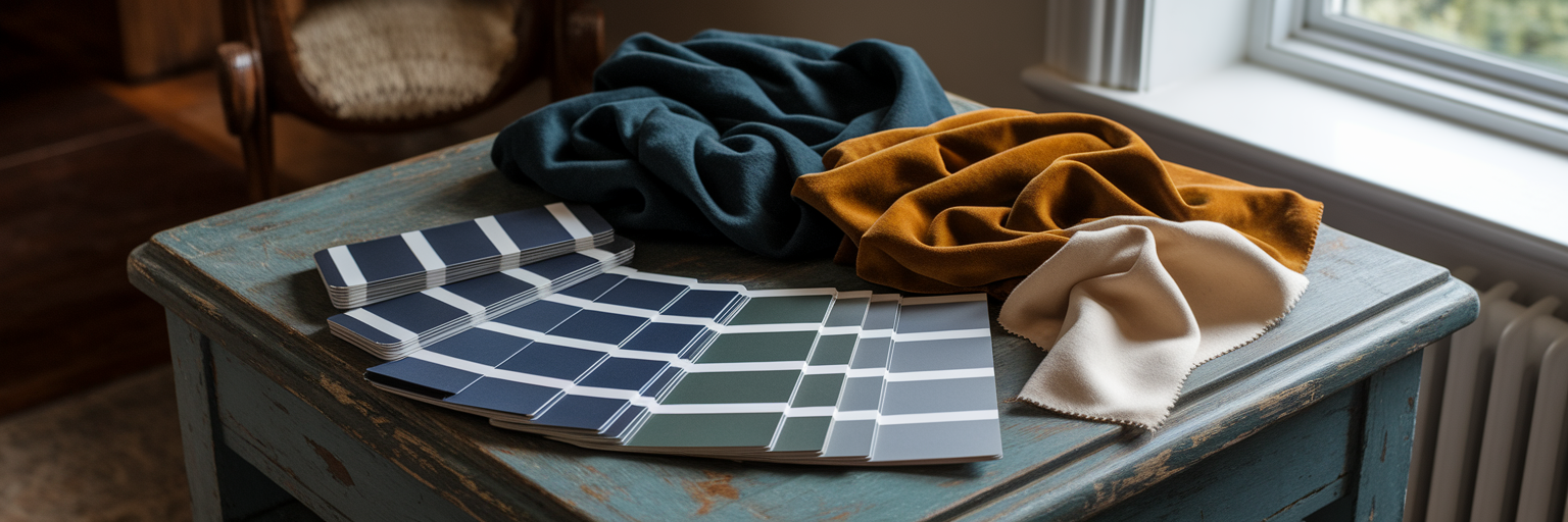
Selecting the right shade is the first step, and it's all about understanding the nuances. These colours are complex, so a little knowledge goes a long way.

Understanding Undertones
Every colour has an undertone, which is the subtle hint of colour that lies beneath the main shade. Dark colours can have cool (blue-based) or warm (yellow/brown-based) undertones.
A charcoal grey with a blue undertone will feel crisp and modern, while one with a brown undertone will feel warmer and more earthy. My top tip, especially for us in the UK with our ever-changing natural light, is to always use tester pots.
Paint a large piece of card and move it around the room throughout the day to see how the colour shifts and feels in different lights.

The Magic of Paint Finishes
The finish of your paint has a huge impact. A matte or flat finish absorbs light, which enhances the soft, enveloping feel of dark moody hues and is brilliant for hiding imperfections on older walls. In contrast, an eggshell or satin finish has a slight sheen that gently reflects light.
I love using a matte finish on the walls and then painting the skirting boards and door frames in the same colour but with an eggshell finish. This creates a subtle, sophisticated contrast that adds depth.
To help you visualise, I've put together a table of some popular shades and their pairings. When you're looking for ideas, exploring a deep colour palette for home decor through art can be incredibly helpful. You can see how different shades work together by browsing art collections grouped by colour scheme, which is a fantastic way to find your perfect combination.


| Dark Hue | Undertone | Feels... | Pairs Beautifully With |
|---|---|---|---|
| Charcoal Grey | Cool (blue/green) or Warm (brown) | Sophisticated, Modern, Grounding | Ochre, Blush Pink, Cream |
| Deep Navy | Cool | Classic, Calming, Regal | Brass, Tan Leather, Crisp White |
| Forest Green | Cool | Natural, Restful, Lush | Walnut Wood, Soft Greys, Terracotta |
| Rich Burgundy | Warm | Luxurious, Intimate, Bold | Deep Teal, Gold, Dusty Rose |
Bringing Drama into Your Living Room and Bedroom
 These two rooms are where you can truly have fun with deep colours, creating spaces that are perfect for relaxing and socialising.
The Living Room: A Dramatic Welcome
The living room is the heart of the home, and a deep colour can make it feel incredibly welcoming. If you're hesitant, start with a feature wall behind your sofa to anchor the space. I did this when I created my charcoal grey living room, and it instantly made the room feel more designed and cohesive.
You can then build on this with your furniture. A jewel-toned velvet sofa looks incredibly luxurious against a dark backdrop, while a light-coloured armchair creates a beautiful, striking contrast. This is also where your wall art can truly shine. A collection of our framed wall pictures for living room decor with light-coloured mounts will pop against a dark wall, drawing the eye and adding personality.


The Bedroom: Your Moody Sanctuary
Your bedroom should be your ultimate retreat, and this is where I encourage you to be bold. Painting all four walls in one of the dark moody hues creates an immersive, cocoon-like feeling that is wonderfully conducive to sleep. Many people with small UK bedrooms worry this will make the space feel cramped, but it often has the opposite effect.
It can blur the corners of the room, making it feel more expansive and grand. Creating personal and stylish moody bedroom ideas is all about layering.

Add plenty of soft textures like chunky knit throws, linen bedding, and silk cushions to add warmth and prevent the colour from feeling flat. The final touch? A beautiful piece of wall art for a bedroom to complete your personal sanctuary.

Bold Statements in Kitchens and Dining Areas
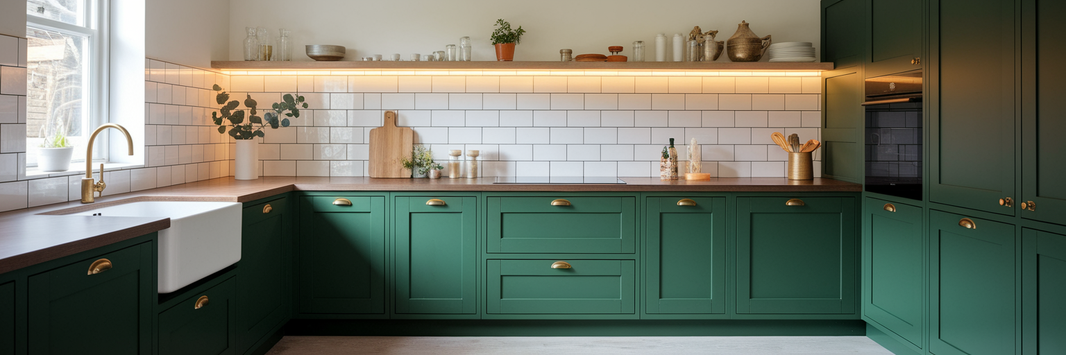
Using dark colours in functional spaces like kitchens and dining areas might feel daunting, but it can be incredibly effective. The key is to be strategic. We're seeing a huge trend for dark green and navy kitchen cabinets in UK homes, and for good reason. They look incredibly chic and timeless.
To keep the space from feeling too heavy, balance the dark cabinets with light-coloured worktops, like a marble-effect quartz, and a reflective splashback made from glossy tiles. The real magic happens with the hardware.
Brass or copper handles and taps act like jewellery for your kitchen, warming up the dark moody hues and adding a touch of glamour. In a dining area, especially in an open-plan layout, painting a single wall in a deep shade can define the space and create an intimate atmosphere for dinner parties.

Add some warm, low-level lighting, and a piece of our kitchen wall art decor to tie it all together.

Layering Textures, Lighting, and Accents
The secret to a successful dark interior isn't just the colour on the walls; it's everything else you put in the room. This is how you bring the space to life.
For a closer look at how to introduce contrast and definition through dark detailing, our guide to black accents covers everything from hardware swaps to statement furniture.
The Power of Texture
Texture is absolutely essential. Without it, dark moody hues can feel one-dimensional.
By mixing different materials, you create visual interest and a tactile quality that makes a room feel rich and inviting. Imagine a charcoal wall.
Now, place a worn leather armchair next to a dark oak side table, and drape a chunky wool throw over it. Suddenly, the space has depth and character. Try to incorporate a mix of textures:
- Soft: Velvet, wool, linen, faux fur
- Hard: Dark wood, metal, stone
- Natural: Rattan, leather, houseplants
A Layered Lighting Scheme
I cannot stress this enough: lighting is everything in a dark room.
You need a layered lighting scheme to make it work. This means using three types of light.
First, you have ambient light, which is your main overhead source. Second is task lighting, like reading lamps or under-cabinet lights. Finally, there is accent lighting, such as picture lights to highlight art or uplighters to wash a wall with a soft glow. Using dimmer switches on all your lights is a non-negotiable.

This allows you to control the atmosphere completely, from bright and functional to soft and moody. Mirrors are also your best friend, as they bounce light around the room. The right art, like one of our bold abstract art prints, can also act as a bright, dynamic accent, adding a final layer of life to the dark moody hues.
Common Mistakes to Avoid When Using Dark Moody Hues
Over the years, I've learned a few things, sometimes the hard way!
Here are some common mistakes to avoid so you can get it right the first time. The number one mistake is forgetting about light.
A room with poor natural light needs a very careful and comprehensive lighting plan if you're going to use a dark colour.
Another common pitfall is using too many dark elements without any contrast. Balance is key. You need lighter elements, whether it's the floor, the ceiling, a large rug, or your artwork, to create relief and prevent the room from feeling oppressive.
Finally, don't ignore the room's purpose. The goal of using dark moody hues is often to create a cosy, 'jewel-box' feeling, not to make a small space feel bigger.

Embrace the intimacy. To ensure you choose the right shade, here is my advice on how to use dark paint colours correctly:
- Buy tester pots of your top two or three choices.
- Paint large A2 sheets of paper or card, not just a small patch on the wall.
- Move these painted sheets around the room at different times of the day.
- Observe how the colour changes in the morning light, on a cloudy afternoon, and under artificial light in the evening. This will give you a true sense of how the colour will live in your space.


More About…
Embark on a journey of creating atmospheric and personal interiors. Learn how to choose colours that add drama and sophistication. Join us as we explore the topic of Dark Moody Hues: How to Add Drama and Depth to Your Interiors. Click here to uncover more inspiration and tips for decorating with deep, dramatic tones.
Pro Tips…
Feeling inspired to explore these styles further? You can find a wealth of ideas and see how different trends come to life on our Content Hub. It's the perfect place to gather inspiration for your next project.
If you want to see these ideas in action, our Content hub offers plenty of visuals to guide you. Discover inspiring Home decor tips and trends to suit a variety of styles and moods.
- How to Choose Wall Art for Your Home
- The Ultimate Guide to Creating a Gallery Wall
- Colour Psychology in Interior Design: How to Choose Hues That Heal
I hope this guide inspires you to view wall art as both a decorative element and a powerful tool for creating a sanctuary tailored to your relaxation needs.
One of the most effective ways to introduce dark, moody hues into a room without committing to four walls is to create a single accent wall — a treatment that concentrates drama exactly where you want it.
Which style are you leaning towards? Let me know—I'd love to hear your ideas!


