

The Role of Colour in Office Spaces: Create Productivity Through Design
by Mae Osz on Dec 13, 2025
The colours you surround yourself with at your desk matter more than most people realise. Research consistently shows that different hues can shift your mood, sharpen your concentration, or spark fresh ideas — making the thoughtful use of colour in office spaces one of the most effective (and most overlooked) tools in home office design. Whether you work from a dedicated study or a corner of the living room, this guide will help you choose the right shades and artwork to support the way you work best.
By Mae Osz | Interior Design Consultant & Home Decor Expert with 12+ years of experience.
Have you ever thought about how the colours in your workspace and the artwork on your walls can shape your productivity and mood?
Your home office should be more than just a desk in a corner—it should be a sanctuary that supports focus, creativity, and well-being.
In this guide, I’ll share practical tips for choosing unique wall art and colour schemes that transform your workspace into a room you genuinely enjoy spending time in. Understanding workspace colour psychology is the first step to creating a personalised and productive environment that works for you every day.
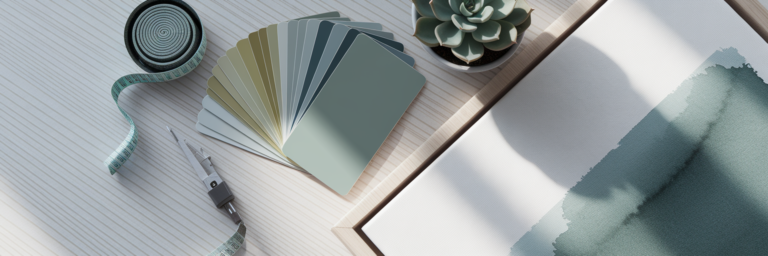 List of Contents
- Colour Psychology and the Workspace: What the Research Says
- Warm Colours for Energy and Creative Flow
- Cool Colours for Calm and Deep Focus
- Using Accent Colours with Wall Art
- Pro Tips…
- What Each Colour Actually Does in a Workspace
- How to Use Colour Effectively Without Repainting
Colour Psychology and the Workspace: What the Research Says
I always think of colours as having different personalities, and understanding them is the secret to a well-designed room. This is the foundation of interior design colour psychology.
Warm colours like reds, oranges, and yellows are the extroverts of the colour wheel. They bring energy and can make a space feel vibrant and stimulating.

On the other hand, cool colours like blues, greens, and purples are associated the introverts. They create a sense of calm and are brilliant for helping you concentrate.

Then you have your neutrals—whites, greys, and beiges. These are the essential foundation, but I always caution against relying on them too heavily. A room with only neutrals can sometimes feel a bit flat or uninspiring.

This is where thoughtful colour selection in your workspace really comes into play. By layering in colour through art, you add depth and personality. As noted by industry resource Wbwood.com, office colour psychology is the practice of using colour to consciously influence emotions and actions.
If I need to feel more alert for a morning meeting, I find that a piece of art with hints of yellow gives me a gentle nudge. These principles are your toolkit for choosing effective home office wall art ideas. A great way to start is by browsing art collections sorted by colour to see what speaks to you.
Warm Colours for Energy and Creative Flow
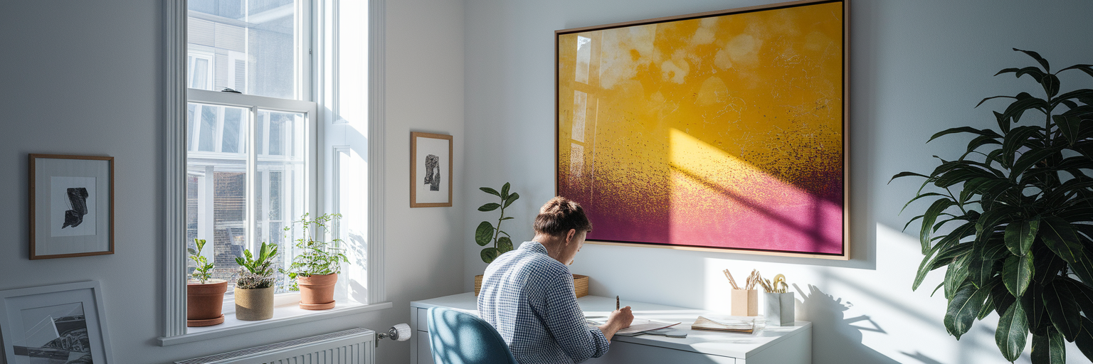 When your day calls for brainstorming and big ideas, you need a space that sparks creativity. This is where those energetic warm colours truly shine.
Yellow is fantastic for optimism, while orange can bring a wave of positivity and enthusiasm. Now, I’m not suggesting you paint an entire wall bright orange. That might be a bit much! Instead, the key is to use these colours strategically through your wall art.

A deeper understanding of workspace colour psychology allows for this kind of targeted, intentional use. You can introduce these vibrant shades as accents in abstract prints or make one the star of a single, bold piece.
I have a piece with a splash of sunny yellow opposite my desk, and it honestly gives me a little boost of cheer on a grey Monday morning. It catches my eye and reminds me to think brightly.
These kinds of home office wall art ideas are about curating moments of energy rather than overwhelming the senses. If you're looking for that perfect energetic piece, exploring a collection of abstract art prints can be incredibly inspiring. They allow you to play with colour in a sophisticated and modern way.
Colour is just one piece of the puzzle — for the full picture, our guide to creative office wall design ideas brings together artwork, functional features, and styling tips to help you design a workspace you love.
Cool Colours for Calm and Deep Focus
For the times you need to block out distractions and get into a state of deep focus, your environment should feel like a quiet retreat. This is where cool tones come to the rescue. Blue is known to promote feelings of stability and calm, while green connects us to the natural world and can help reduce feelings of anxiety.

These are the perfect calming colours for work. I love suggesting wall art that features these tones, such as serene landscape photography.
A print of a misty morning or the coast can be wonderfully restorative. There's something so peaceful about bringing that feeling indoors with coastal decor.

Botanical prints or abstract art with soft watercolour blues and greens are also beautiful options. These pieces can serve as a 'visual escape', giving your mind a place to rest for a moment.

This is a crucial aspect of designing a productive and calming workspace. I like to position a large print of a forest scene in my line of sight. When I look up from my screen, it feels like taking a deep breath and helps me reset my focus. It’s a simple trick that makes a huge difference in crafting thoughtful home office decor.
Using Accent Colours with Wall Art
 Now for the fun part: putting it all together. Using accent colours is how you inject your personality into your office space without creating visual clutter. This is where home office colour choices become about nuance and personal style.
You don’t need a lot of colour to make an impact. A few small, strategic pops can bring a neutral room to life. One of my favourite ways to do this is by creating a gallery wall that mixes neutral prints with one or two smaller, colourful pieces that draw the eye.

If you're inspired to create your own, you can find beautiful combinations in our gallery wall art collections. Here’s a stylish tip for those working from home for a company: you could even use a colour from your company's branding in a subtle, chic way through an abstract piece. It feels much more personal than a logo.

This table is a quick guide to help you pair background colours with art accents to achieve your desired atmosphere. Think of it as a recipe for your room's mood.
| Goal | Primary Colours (Walls/Furniture) | Accent Colour (in Wall Art) |
|---|---|---|
| Calm & Focused | Soft Grey, White, Light Wood | Deep Blue, Forest Green |
| Creative & Active | White, Light Grey | Sunny Yellow, Coral Orange |
| Balanced & Modern | Greige, Charcoal | A touch of Red or Teal |
What Each Colour Actually Does in a Workspace
If you want to make confident decisions about your office palette, it helps to understand what each major colour is likely to do for you. The top-ranking guides on this subject all take a colour-by-colour approach — and for good reason: the effects are genuinely distinct.
Blue is the most reliably productive colour for focused, detail-oriented work. It slows the heart rate slightly and encourages a steady, methodical mindset — ideal for writers, analysts, and anyone who needs long stretches of uninterrupted concentration.
Green is the easiest colour on the eye and is closely linked to balance and reassurance. Because it sits in the middle of the visible spectrum, it requires no adjustment from the eye, making it a brilliant background tone for very long working days.
Yellow triggers optimism and sparks original thinking. Even a small amount — say, a single print with warm golden tones — can lift the energy of an otherwise neutral room.
Orange combines the energy of red with the cheerfulness of yellow. It is associated with enthusiasm and social confidence, which makes it a natural choice for breakout or brainstorming corners rather than heads-down focus zones.
Red is the most physically stimulating colour: it raises the heart rate and sharpens attention to detail in short bursts. Use it as a controlled accent through artwork rather than a dominant wall colour to avoid overstimulation.
Purple is associated with creativity and imaginative thinking, and softer lavender tones in particular can feel both calming and quietly inspiring — a good choice for writers and designers.
Understanding what each hue brings to the table means you can layer colours deliberately through your office wall design choices, rather than leaving the feel of your workspace to chance.
How to Use Colour Effectively Without Repainting
Not everyone can repaint their office — especially in rented homes or shared spaces. The good news is that wall art is one of the most flexible and reversible ways to shift the colour energy of a room without touching the walls themselves.
A large-format print in a deep teal or sage green will carry the visual weight of a full accent wall. A set of three coordinating prints creates a cohesive palette across an entire wall without a single tin of paint. And because art can be swapped out whenever your needs or tastes change, it gives you far more creative control than a fixed paint colour ever could.
The 60-30-10 rule is a useful starting point: let your dominant neutral (walls, furniture) account for roughly 60% of the visual field, your secondary tone (shelving, curtains, a desk chair) for 30%, and your accent colour — introduced through artwork — for the final 10%. That small 10% of accent colour does a disproportionate amount of the emotional work in a room.
When choosing pieces, consider the direction your room faces. North-facing offices tend to feel cool and benefit from warmer-toned artwork to compensate. South-facing rooms can handle cooler blues and greens without feeling cold. This is the kind of nuance that turns a well-decorated office into one that genuinely supports the way you work.
More about…
House & Garden's home office ideas show how real spaces use colour and layout to create workspaces that are both practical and beautifully designed.
Embark on a journey of designing a workspace that truly inspires you. Learn how to choose colours and art that support your focus and well-being. Join us as we explore the topic of The Role of Colour in Office Spaces: Create Productivity Through Design. Click here to uncover more inspiration and tips for decorating your personal sanctuary.
Pro Tips…
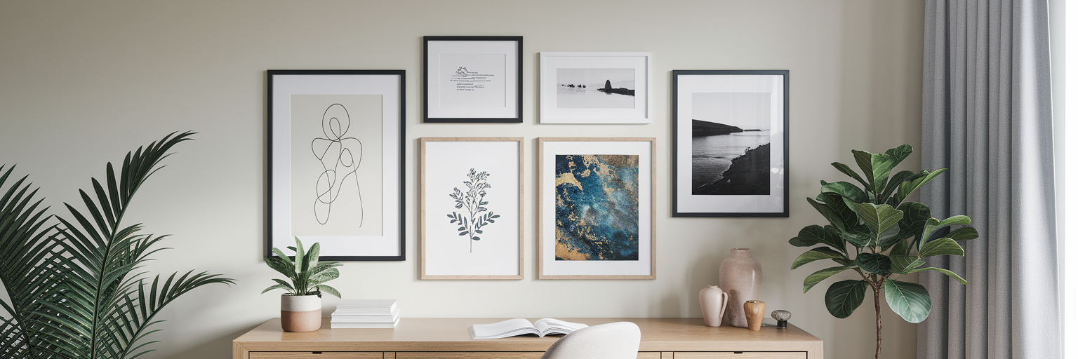 Feeling inspired to find the perfect piece for your own home office? Sometimes, seeing how others have used colour and art is the best way to spark an idea. It helps you visualise what’s possible in your own space and discover new styles you might not have considered. If you're curious to see how these ideas come to life, explore our latest articles on home decor inspiration for a wealth of beautiful examples.
Visual Inspiration from Our Content Hub
If you want to see these ideas in action, our Content hub offers plenty of visuals to guide you. Discover inspiring Home decor tips and trends to suit a variety of styles and moods.
- How to use colour psychology in interior design
- Inspirational Prints for Your Main Living Spaces
- Creative Office wall design ideas to inspire productivity
I hope this guide inspires you to view wall art as both a decorative element and a powerful tool for creating a sanctuary tailored to your relaxation needs. Which style are you leaning towards? Let me know—I’d love to hear your ideas!
If you're ready to take the next step, our practical guide to decorating a professional office walks you through layout, furniture, and colour palette choices that work together cohesively.


